TopoArtic
Every architect who has ever held a site survey has read contour lines — the mathematical notation that translates the three-dimensional surface of the earth into a two-dimensional map. The lines are precise, objective, and abstract. TopoArtic asks what happens when those lines are treated not as technical notation but as the earth’s own signature — and when the architectural act of cutting through them becomes the subject of art.
Ibrahim Nawaf Joharji developed TopoArtic from a sustained fascination with the mathematics of topographic representation. The contour line is governed by the equation z = f(x,y) — where z is elevation and x,y are coordinates on a plane — a formula that produces a surface map of the earth’s variations, each line marking a constant altitude. No two mountains produce the same contour map. Like a fingerprint, like a DNA sequence, the pattern of lines that describes a particular mountain describes only that mountain and no other. This uniqueness is the first principle of the TopoArtic series: the contour is not a convention for representing terrain. It is the terrain’s genetic identity made visible.
Artist Ibrahim Nawaf Joharji
Series TopoArtic — Volumes 1 through 13
Medium Cut Contour — Digital and Physical
Style Registered Design Identity
Year 2024
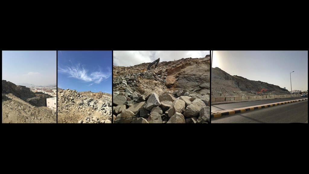
Scope Art, Architecture, Topographic ResearchThe central act of TopoArtic is the cut. In architecture and construction, cut and fill is the foundational technique by which the built environment reshapes natural terrain — a mountain is sliced to produce a flat platform for a road, a hillside is excavated to create a foundation, a quarry removes mass to extract marble. Every major infrastructure project in human history has performed this act. The mountain endures it, holds its remaining form, and continues to produce the pattern of contours that identifies it. TopoArtic captures this moment — the cross-section produced by the cut — and makes it the work itself.
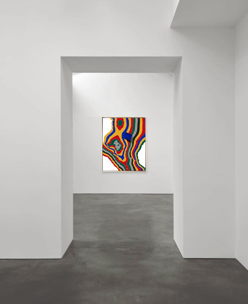
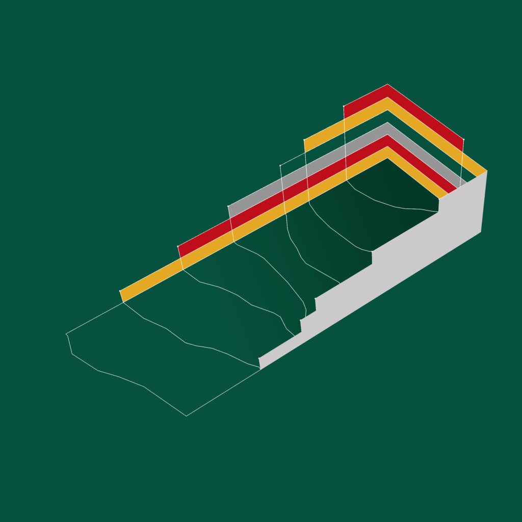
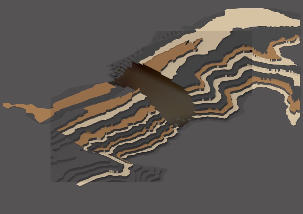
What the cut reveals is shadow. When a contour map is physically sliced at one of its elevation lines and the layers above are removed, the remaining form casts shadows into the section that no plan view or elevation could produce. These shadows are not incidental — they are the direct consequence of the cut’s geometry, the same shadows that appear in a quarry face, in a road cutting through a hillside, in an excavation that exposes the earth’s strata. TopoArtic treats these shadows as the primary visual subject. The color fields, the gradient bands, the chromatic variation across the surface — all of them are read against and through the shadow pattern that the cut creates. The work is not a representation of a mountain. It is a mountain section, and the architectural act of sectioning is what makes it art.
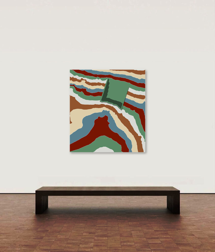
The cut contour as a medium and as a registered design identity has no known precedent. Artists have worked with topographic layers — Maya Lin’s earth memorials, BIG’s landscape-integrated buildings — but none has isolated the cut section itself, with its shadow play and its material strata, as the central subject of a sustained artistic series. The series progresses through thirteen volumes, each developing a different dimension of the core proposition. Vol.1 establishes the organic flow of the uncut contour. Vol.7 introduces the first cut — the inaugural experiment in sectioning — and from that point the series becomes an investigation of what the cut reveals: depth, color, memory, resilience, and the relationship between the geological time of the mountain and the human time of the intervention.
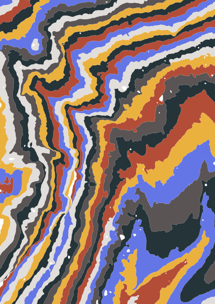
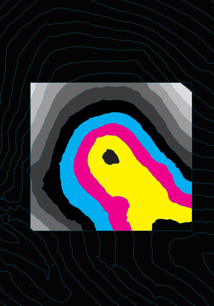
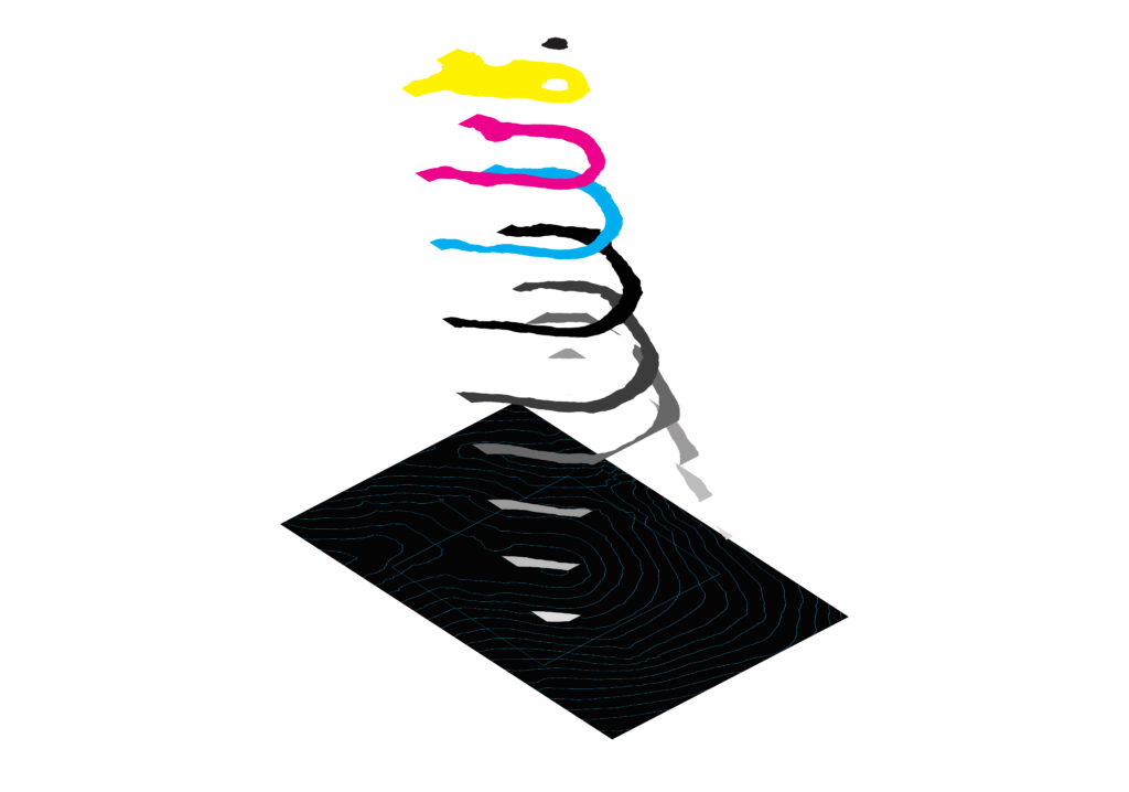
The color system in TopoArtic departs from the conventional use of gradient hues in topographic cartography — where blue signals sea level, green signals lowland, brown signals elevation — and replaces it with a chromatic language chosen for its narrative rather than its indexical function. Each volume’s palette carries its own logic: Vol.2’s soft pink and yellow reads the contour as childhood memory; Vol.3’s aubergine holds the break in the contour as a contemporary material reference; Vol.4’s radiating orange treats the mountain’s center as a heat source. The colors are not describing elevation. They are describing the mountain’s inner character — the quality that its genetic uniqueness produces when the section is made and the shadow falls.
Vol.8 extends the series into its most conceptually expansive territory. The Human Form takes the contour cut and finds within it the outline of a human body — the same mathematical equation that describes a mountain describing, in a different arrangement of values, the form of a person. The geological and the biological share the same representational logic. The mountain has a genetic print; so does the human. The contour line captures both. This equivalence is not metaphorical in TopoArtic — it is mathematical. The z = f(x,y) equation is indifferent to whether the surface it describes is stone or skin.
Vol.9 — For the Upcoming Mansion — introduces the series’ most direct architectural proposition. The mountain section is not displayed as a completed artwork but as the foundation of a building yet to be designed. The cut terrain is the site. The contour lines define the building’s relationship to the ground before any architectural decision is made. This volume makes explicit what the entire series has been arguing implicitly: that the architect’s first act — reading the contour map, understanding the terrain, deciding where and how to cut — is already an artistic act. TopoArtic returns this act to visibility. It removes the building that would conventionally complete the section and asks the viewer to look at the section itself, at the shadow the cut produces, at the genetic uniqueness of the form that the mountain’s own history has created.


| Volume | Title | Description |
|---|---|---|
| Vol.1 | The Beginning | The inception of the idea — organic contour flow rendered through five foundational color codes. |
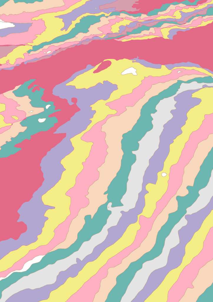
| Vol.2 | Childhood Hues | Pink and yellow read the contour as memory, the mountain’s form held in the palette of innocence. |
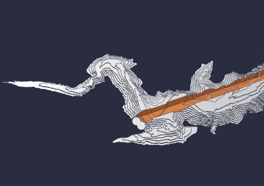
| Vol.3 | Aubergine Gradient | A deliberate break in the contour line, its deep purple referencing 2024’s material color culture. |
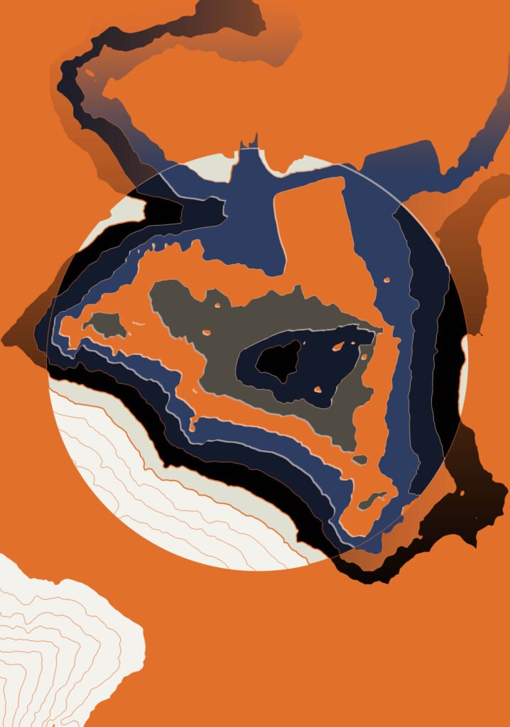
| Vol.4 | Heart of Orange | The mountain’s center treated as a heat source, its warmth radiating outward through the contour bands. |
| Vol.5 | Pure Colors | The contour stripped of complexity — form and color held in their most direct relationship. |
| Vol.6 | New York Vibe | The American flag’s chromatic energy applied to terrain, the landscape of a city read as landscape. |
| Vol.7 | The First Cut | The inaugural section — the moment the mountain is cut and its shadow becomes the subject. |
| Vol.8 | Human Form | The same mathematical equation that describes a mountain found to describe a body. |
| Vol.9 | For the Upcoming Mansion | The cut terrain as foundation — the section that will become someone’s site. |
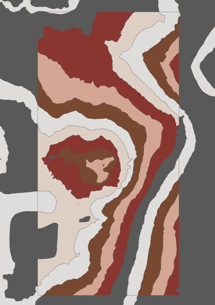
| Vol.10 | Earthy Tones | The mountain’s own palette returned to it — soil and rock as chromatic source. |
| Vol.11 | American Terrain | The rugged landform character of the American west held in a single section. |
| Vol.12 | For the People | A mountain open to interpretation — the contour section as public territory. |
| Vol.13 | The Mountain for Two | A double cut designed for two mansions — natural form and human habitation as a single proposition. |
TopoArtic is registered under INJ Architects as a distinct artistic identity — the cut contour style as a design language that belongs to this practice and to this artist. It belongs to a body of work that treats the boundary between architecture and art not as a professional category but as a productive tension to be inhabited. The broader design philosophy that grounds this work is detailed in how-we-work. For collectors, institutions, and developers interested in commissions from the TopoArtic series or in the application of its topographic language to architectural projects, the engagement framework is outlined in bespoke-architecture.