In a profession that historically prized symmetry, order, and alignment, the rise of architectural misalignment feels like a provocation. And yet, more and more contemporary architects are choosing to intentionally shift, tilt, offset, or dislocate elements in their designs. Walls don’t quite meet, windows sit just a bit off-center, and staircases lead to unexpectedly skewed thresholds. This is not error—it’s expression.
Architectural misalignment is the deliberate act of disrupting formal harmony to achieve emotional, contextual, or conceptual impact. Whether used to reflect tension, highlight transitions, or simply to challenge the viewer’s spatial expectations, misalignment can be a powerful design language that evokes discomfort, surprise, or curiosity.
This article explores how misalignment has evolved from taboo to tactic. From historical precedents to contemporary experiments, we’ll trace how these “errors” in alignment are often precisely the moments that speak loudest in architectural storytelling.
The Symmetry Obsession: A Brief History
Classical architecture revolved around balance. From Vitruvius to Palladio, alignment was more than aesthetic—it was moral. Columns lined up in harmonious orders; facades were mirrored along central axes. In this tradition, misalignment was synonymous with failure.
Even the advent of modernism, with its rejection of ornament and embrace of function, maintained a visual rigor. The white boxes of the International Style, despite their abstract forms, were meticulously aligned. Grids ruled the skyline.
So when did we start to see misalignment as meaningful rather than mistaken?
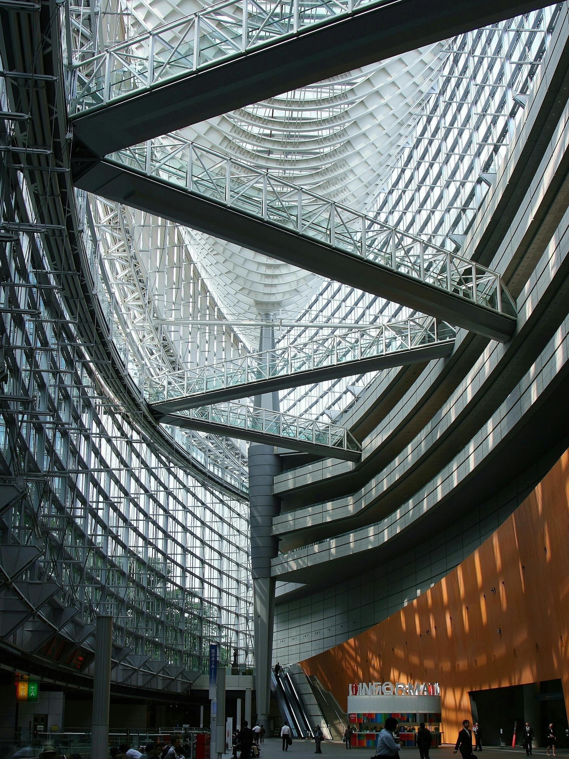
Misalignment as Meaning: Breaking the Grid
Architectural misalignment emerged as a conscious gesture in the late 20th century, coinciding with the rise of postmodernism and deconstructivism. Architects like Frank Gehry, Zaha Hadid, and Peter Eisenman began to manipulate geometry not just for function or form, but to disrupt expectations.
In Eisenman’s Wexner Center for the Arts, grid lines collide, columns miss their beams, and staircases slice through space without symmetry. The building is not broken—it is fragmented by design. Here, architectural misalignment speaks to the collapse of singular meaning in the postmodern world.
Similarly, Hadid’s MAXXI Museum in Rome is a masterclass in directional tension. Hallways lean, planes intersect at non-orthogonal angles, and walls seem in perpetual motion. The effect is not confusion, but dynamic engagement. Users become active navigators rather than passive observers.
Why Architects Misalign
Far from being random, misalignment in architecture often serves one or more of the following purposes:
- Psychological Tension: Slight dislocations can create unease or attentiveness. A doorway that doesn’t line up signals importance—or dissonance.
- Narrative Breaks: Misaligned elements signal a shift in program, use, or era. A modern annex misaligned from a historical core makes its difference legible.
- Site Responsiveness: Buildings on irregular plots often require adjusted geometries. Here, misalignment is necessity turned into design opportunity.
- Visual Play: Sometimes, the skew is just fun. Playful misalignments, especially in interiors or furniture-scale elements, can add surprise.
Case Studies in Misalignment
The Jewish Museum Berlin by Daniel Libeskind famously embodies misalignment as trauma. The building’s jagged walls, voids, and tilted axes mirror the rupture of history. Nothing lines up—and it shouldn’t.
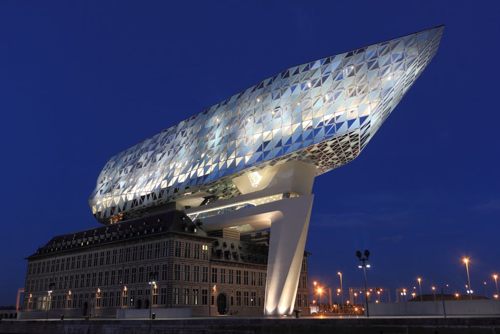
In contrast, OMA’s Casa da Música in Porto misaligns volumes to create spatial complexity. Each facade is different, each room oddly shaped. The building resists easy legibility, encouraging users to experience it anew with every visit.
Even in small-scale residential projects, architectural misalignment can create resonance. Offset windows capture specific light angles. Non-aligned doors suggest directionality or privacy. When done well, misalignment makes a house feel less like a machine, more like a narrative.
The Danger of Arbitrary Skew
Of course, not all misalignment is meaningful. Poorly considered deviations can read as mistakes rather than intent. This is especially true when alignment is broken without justification, leading to functional awkwardness or user confusion.
Thus, misalignment requires a high level of design literacy and execution. The detail must resolve. The skew must serve. As with jazz, the “wrong” note only works if the musician knows exactly why it’s there.
Misalignment in Digital Architecture
Parametric and generative tools have amplified the use of architectural misalignment. With software like Grasshopper or Rhino, architects can create highly controlled asymmetries, layering misaligned grids, dynamic shifts, and warped geometries.
These tools have pushed the boundaries of what misalignment can look like—no longer just a rotated wall or offset column, but entire building systems that flex and pivot across data inputs. It’s no longer about a single break in alignment, but alignment as a moving, breathing system.
Reconsidering Order
At its core, architectural misalignment is a philosophical stance. It suggests that order, while beautiful, is not always truthful. By allowing things to slightly not line up, architects reflect a more honest relationship to site, context, user, and uncertainty.
We live in fragmented times. Misaligned architecture mirrors that fragmentation—not to glorify chaos, but to create spaces that feel alive, responsive, and real.
Conclusion
Architectural misalignment is no longer a mistake. It’s a tool—subtle, provocative, and deeply human. It invites us to look closer, to question assumptions, and to find meaning not just in perfection, but in purposeful deviation.
In a world obsessed with symmetry and control, perhaps it’s in the places where nothing quite lines up that architecture finds its most honest voice.