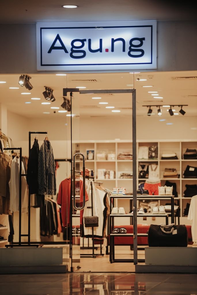
Retail Store Design: How Layout Drives Sales
Walk into any successful retail store and you’ll notice something you probably won’t consciously register: every inch of that space was engineered to influence your behavior. Where you enter, how you move, what you see first, where you linger, these aren’t accidents. They’re the result of deliberate architectural decisions designed to maximize a single outcome: sales.
At INJ Architects, we approach retail design as a discipline where aesthetics and commerce are inseparable. A beautiful store that doesn’t sell is a failed design. Here’s how layout actually drives purchasing behavior, and what every retail brand should understand before designing their next space.
The Decompression Zone
The first five to fifteen feet inside any store entrance is what retail designers call the “decompression zone.” Customers entering this area are still transitioning, adjusting their eyes, shedding the mindset of the street outside, and orienting themselves. Studies consistently show that shoppers don’t register signage, promotions, or products placed immediately at the entrance.
This means the worst place to put your best merchandise or your most important sale signage is right at the door. Smart retail design treats this zone as a buffer, often using it for brand statement pieces or simply open space, while saving commercially critical placements for just beyond it.
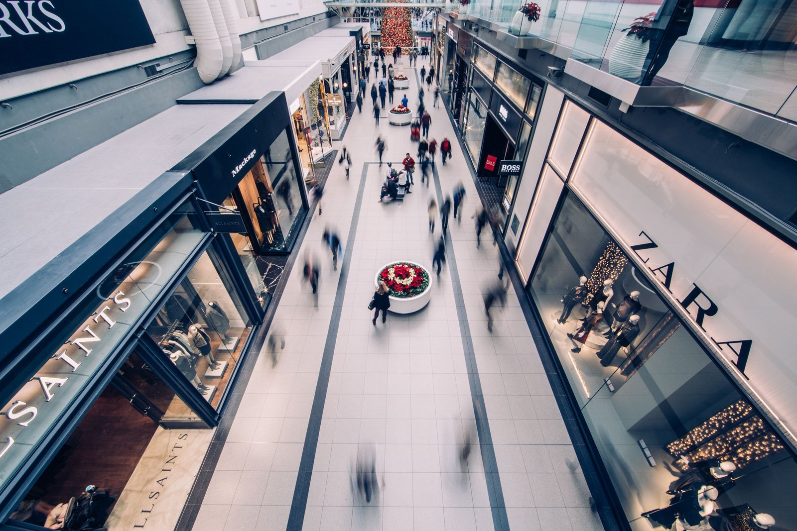
The Power of the Right-Hand Turn
In countries where traffic moves on the right, the majority of shoppers instinctively turn right upon entering a store. This isn’t a marketing myth, it’s a well-documented behavioral pattern. This means the right-front quadrant of any retail space becomes the most valuable real estate in the store, often called the “power wall” or “decompression wall.”
This is where new arrivals, seasonal promotions, or your highest-margin products should live. Retailers who place clearance items or low-priority stock in this zone are leaving revenue on the table. Architecture either supports or undermines this natural flow, and a well-designed layout works with it rather than against it.
Sightlines and the Invitation to Explore
Good retail layout creates visual invitations, glimpses of what’s deeper in the store that pull customers further in. This might mean strategic gaps between fixtures, elevated focal displays visible from the entrance, or lighting that draws the eye toward the back of the space.
A common mistake is designing a layout where customers can see the entire store from the entrance. Once a shopper believes they’ve seen everything, they’re far more likely to leave without exploring. Architecture that conceals just enough, through partial walls, angled fixtures, or varying ceiling heights, creates curiosity, and curiosity creates dwell time. Dwell time, consistently, correlates with sales.
The Race Track Effect
Many large format stores, from fashion retailers to home goods chains, use a layout known as the “race track” or “loop” design. This creates a defined path that guides customers past the maximum number of products before reaching the checkout. Rather than a grid of aisles customers can navigate freely, a loop layout subtly controls the journey.
This doesn’t mean customers feel trapped, when done well, the path feels natural and exploratory rather than forced. The architectural skill lies in disguising the structure so it reads as an experience rather than a maze. Boutique and luxury retail often use a softer version of this, with curving paths and strategically placed focal points rather than a rigid loop.
Anchor Points and Magnet Products
Every retail layout benefits from “magnet” locations: spots designed to pull customers through the store. In grocery stores, this is why essentials like milk and bread sit at the back. In fashion retail, it might be a striking visual display or a category customers specifically seek out.
Positioning these magnet points strategically throughout the store, rather than clustering them, forces customers to traverse more of the space, increasing exposure to impulse purchases along the way. This is architecture functioning as a circulation strategy, not just a spatial one.
Checkout Placement and Friction
The checkout area is one of the most architecturally underestimated parts of retail design. Its placement affects not just operational efficiency but psychological comfort. Checkouts positioned too close to the entrance create a subtle sense of pressure, as if customers are being watched on their way in. Checkouts placed too far from natural traffic flow create frustration and abandoned purchases.
The most effective designs position checkout areas at natural endpoints of the customer journey, often near the final product categories customers browse, while keeping sightlines to the checkout visible from most areas of the store so customers always feel oriented.
Lighting as a Layout Tool
Lighting isn’t just about visibility, it’s a layout instrument. Brighter zones naturally draw the eye and feel more important, while dimmer areas recede. Retailers use this to guide attention toward featured products or new arrivals without needing additional signage. A well-lit focal display at the end of a sightline can pull customers across an entire store more effectively than a sign ever could.
Architecturally, this means lighting design needs to be considered alongside layout from the earliest design phase, not added afterward as a finishing touch.
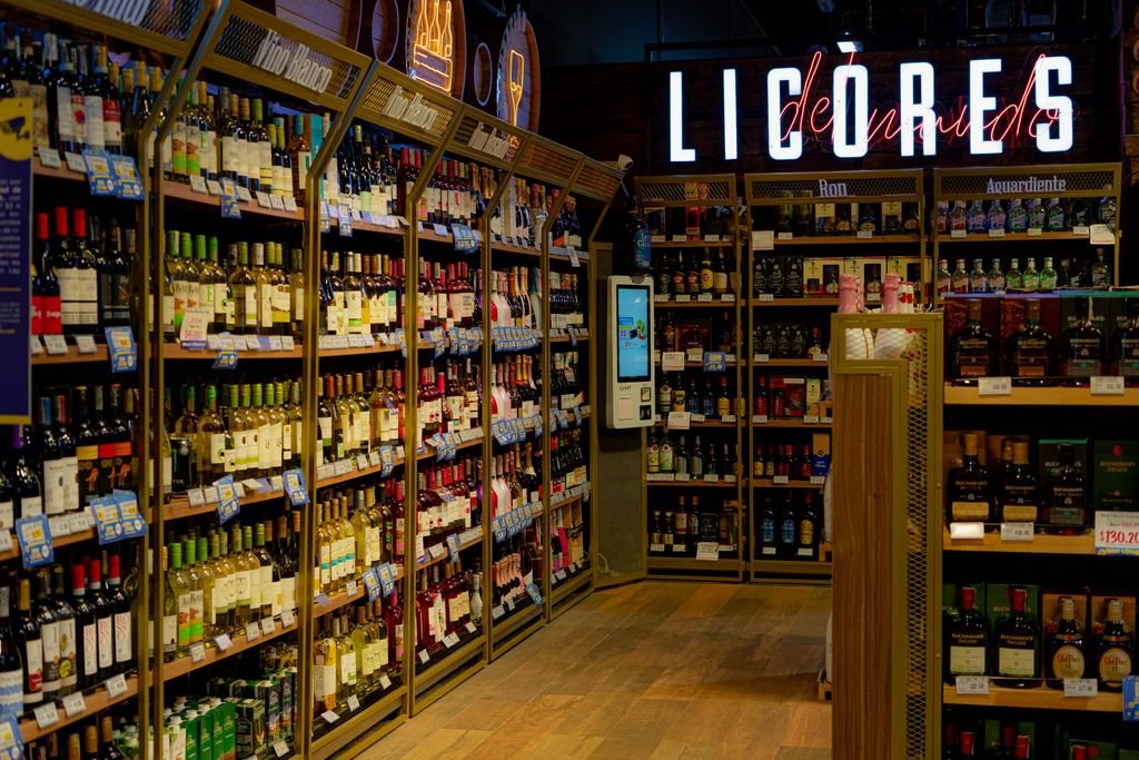
Scale, Spacing, and Comfort
Aisle width and fixture spacing directly affect how long customers stay. Aisles that feel too tight create what retail designers call the “butt-brush effect,” where customers avoid browsing in areas where they risk being physically bumped by other shoppers. This single factor has been shown to measurably reduce time spent browsing and, consequently, sales.
Conversely, excessive open space can make a store feel empty or under-stocked, undermining perceived value. The right balance depends on brand positioning, a discount retailer benefits from a denser, fuller feel, while a luxury boutique benefits from generous space that signals exclusivity.
Why This Requires Architectural Thinking, Not Just Merchandising
Retail layout is often treated as a merchandising decision made after the architecture is complete. This is a mistake. Circulation patterns, sightlines, ceiling heights, structural columns, and lighting infrastructure all need to be considered together from the earliest design stages. A store that’s architecturally beautiful but commercially poorly organized will underperform, regardless of how good the products are.
The most successful retail spaces are the ones where architecture and commercial strategy were designed in conversation with each other from day one, not bolted together after the fact.
Summary
Retail store layout directly influences customer behavior and sales by controlling movement, sightlines, and product exposure. Key strategies include using a decompression zone at the entrance, placing high-value products in the natural right-turn area, designing sightlines that encourage exploration, and guiding customers through planned circulation paths like loops or race-track layouts. Anchor products, strategic lighting, and well-placed checkout zones further shape the shopping journey, while proper spacing ensures comfort and longer browsing time. Effective retail design integrates architecture and commercial strategy from the beginning to maximize engagement and purchasing.