The Influence of Color on Architecture
First: Red
Depending on the hue, red can connote passion, enthusiasm, or warmth, but it can also connote dread or danger. The way color is employed and the layout of the place can influence how it is viewed. Darker, maroon tones can be seductive and seductive, but bright, neon reds are welcoming and eye-catching. If done incorrectly, all-encompassing red can be overpowering, but when done correctly, it can provide a distinct ambient experience. Red touches in otherwise neutrally colored settings can also be an effective way to call people’s attention to specific objects or aspects.
Color #2: Orange
Orange can be used in architecture to produce relaxing, light, and pleasant places, despite its unusualness. Orange areas are less flashy than red spaces, yet they are still bright and joyful. It is less dangerous to use in large quantities because it is less aggressive.
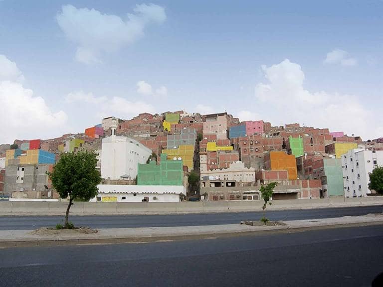
Color #3: Yellow
Yellow is always bright and cheerful, and it may be utilized all over a room or to draw attention to specific aspects without being as overwhelming as red. It is widely utilized in children’s places such as daycares and kindergartens due to its welcoming and whimsical connections, and its brilliance is conducive to making any dreary or dismal area look instantly brighter. Yellow tones that are paler or more orange may appear calmer.
Color #4: Green
Green – particularly emerald green or pastel green – is another unique color for building that is quite peaceful and pleasant. Even neon green, despite its brightness, appears more serene than other neon colors. However, if utilized incorrectly, yellow-green can feel weirdly clinical, especially when paired with white. Externally, green walls and roofs imply sustainability while also conveying a welcoming warmth.
Color #5: Blue
Blue is calming, reassuring, dignified, and safe. Individual blue features such as columns or furnishings are among the most prevalent uses of the main hue in architecture, while it connotes the celestial on ceilings. In outdoor locations, blue light installations are also among the most effective.
Color #6: White
Because of its implications for purity and cleanliness, white walls are one of the most common characteristics of modern architecture. They encourage dramatic shadows and flat, clean facades on outer walls, while inside white walls can make users feel peaceful but alert. White ceilings and walls absorb light and make interior areas appear brighter.
Last: Black
Black structures have a calm and meditative appearance, however, they can also be ominous under some conditions. Black interiors and black exteriors can benefit from thoughtful lighting to make rooms and facades feel less dark and depressing. While the black wooden building may appear rustic and isolated, black metal detailing is typically elegant and contemporary.
Conclusion
In both architectural interiors and exteriors, color has great expressive power. When using color, even something as simple and common as black and white, careful consideration of lighting, material, and design is required. Only a unified and holistic design can ensure that color use has the desired effect, with each color typically connoting a wide range of emotions from the happiest to the most ominous.
Read more on INJ Architects:
The Role of the Architect in Maintaining a Healthy Lifestyle Through the Right Architectural Design