Color plays a crucial role in architecture, as it has the power to evoke emotions, set the mood, and create a lasting impression. Whether it’s a residential building, a commercial space, or a public structure, the choice of colors can significantly impact the overall design. Architecture Colors have the ability to convey meanings, symbolize cultural significance, and enhance the architectural experience. Therefore, architects must understand the importance of selecting the right colors to create visually appealing and harmonious designs.
One of the primary reasons why color is essential in architecture is its ability to influence human psychology. Different colors have distinct psychological effects on individuals. For example, warm colors like red and orange tend to create a sense of energy and excitement, while cool colors like blue and green evoke feelings of calmness and tranquility. By strategically incorporating these colors into architectural designs, architects can shape the emotions and experiences of the people who interact with the space.
In addition to psychological effects, color also plays a practical role in architecture. For instance, the choice of colors can affect the energy efficiency of a building. Light-colored exteriors reflect sunlight and prevent heat absorption, leading to lower cooling costs. On the other hand, dark-colored roofs can absorb heat and contribute to higher energy consumption. Architects must consider these factors while selecting colors for the exterior surfaces of a building to ensure sustainability and energy efficiency.
The Psychology of architecture colors
Understanding the psychology of color is vital for architects when it comes to creating impactful designs. Each color has its own unique psychological association, which can influence the way people perceive and interact with architectural spaces.
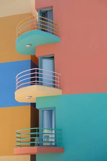
Red, for instance, is often associated with power, passion, and intensity. It can be used to create a focal point or draw attention to specific architectural features. On the other hand, blue is known for its calming and serene qualities. It is often used in spaces where relaxation and tranquility are desired, such as bedrooms or meditation rooms.
Yellow, with its vibrant and energetic nature, can add a sense of optimism and happiness to a design. It is commonly used in spaces where creativity and productivity are encouraged, such as offices or art studios. Green, symbolizing nature and growth, is frequently used in architectural designs to create a sense of harmony and balance.
Understanding the psychological effects of colors allows architects to create designs that resonate with people on a deeper level. By carefully selecting the right colors, architects can elicit specific emotional responses and enhance the overall user experience.
Choosing the Right Color Palette for Your Architecture Project
Selecting the right color palette is a critical step in the architectural design process. A well-chosen color palette can elevate a design and make it visually striking and timeless. Here are some factors to consider when choosing a color palette for your architecture project:
1. Context and Surroundings: Take into account the surrounding environment, such as the landscape, climate, and neighboring buildings. The color palette should harmonize with the surroundings while also standing out in a visually appealing way.
2. Purpose and Function: Consider the purpose and function of the space. Different colors evoke different emotions and have varying effects on functionality. For example, a hospital may benefit from calming and soothing colors, while a restaurant may want to create a vibrant and energetic atmosphere.
3. Cultural Relevance: Colors can hold cultural significance and have different meanings across different societies. It is essential to research and understand the cultural relevance of colors to avoid any unintended associations or misinterpretations.
4. Material Selection: Consider the materials used in the architecture project and how they interact with color. The texture, reflectivity, and opacity of materials can affect the perception of color. Experiment with different material samples to find the perfect combination.
5. Timelessness: Aim for a color palette that will stand the test of time. Trends come and go, but timeless colors can ensure that your design remains visually appealing for years to come. Neutral colors, such as white, gray, and beige, are often a safe choice for creating timeless designs.
By carefully considering these factors, architects can create a color palette that enhances the architectural design and creates a visually striking and harmonious space.
Understanding architecture colors Schemes and Combinations
Once you have selected a color palette, it’s essential to understand how to use color schemes and combinations effectively. Color schemes refer to the arrangement and combination of colors in a design. Here are some popular color schemes used in architecture:
1. Monochromatic: This color scheme uses varying shades and tints of a single color. It creates a harmonious and cohesive design with a sense of simplicity and elegance.
2. Analogous: Analogous color schemes consist of colors that are adjacent to each other on the color wheel. This scheme creates a visual flow and harmony, as the colors are closely related.
3. Complementary: Complementary colors are opposite each other on the color wheel. This color scheme creates a vibrant contrast and can be used to highlight specific architectural features.
4. Triadic: Triadic color schemes use three colors that are evenly spaced on the color wheel. This scheme offers a balance between contrast and harmony.
When combining colors, it’s important to consider their visual weight and intensity. Lighter colors tend to appear more spacious and open, while darker colors can create a sense of coziness and intimacy. Experiment with different color combinations to find the one that best suits your architectural design.
How to Use Color to Highlight Architectural Features
Color can be a powerful tool to emphasize and highlight specific architectural features. By strategically using color, architects can draw attention to key elements and create focal points within a design.
One effective technique is to use contrasting colors. By placing a bright or bold color against a neutral or muted background, the architectural feature will stand out and become a visual focal point. For example, a vibrant red door against a gray facade will immediately draw attention and create a striking entrance.
Another approach is to use color gradients or transitions. By gradually changing the color intensity or hue, architects can guide the viewer’s eye and create a sense of movement. This technique is often used to highlight curved or flowing architectural elements, such as staircases or facades.
Additionally, architects can use lighting to enhance the impact of color on architectural features. The right lighting can accentuate the colors used and create a dynamic and visually captivating space. By considering the interplay between color and light, architects can bring their designs to life and create memorable experiences.
Incorporating Color in Interior Design
While color is often associated with the exterior of a building, it is equally important in interior design. The colors used in interior spaces can significantly impact the atmosphere and mood of the occupants.
When designing interior spaces, architects must consider the function and purpose of each room. Different colors have different effects on human behavior and emotions. For example, warm colors like red, orange, and yellow can stimulate activity and conversation, making them suitable for social spaces like living rooms or restaurants.
On the other hand, cool colors like blue and green have a calming effect and are ideal for spaces where relaxation and concentration are desired, such as bedrooms or offices. Neutral colors like white, beige, and gray are versatile and can create a sense of balance and harmony in any interior design.
In addition to wall colors, architects can incorporate color through furniture, artwork, and accessories. These elements can add pops of color and create visual interest in an otherwise neutral space. By carefully curating the color palette of the interior design, architects can create a cohesive and visually pleasing environment.
Tips for Creating Timeless and Striking Designs with Color
Creating timeless and striking architectural designs with color requires careful consideration and attention to detail. Here are some tips to help you achieve this:
1. Balance Bold and Neutral Colors: Incorporate bold and vibrant colors as accents to create visual interest while maintaining a neutral color palette as the foundation. This ensures that the design remains timeless and can easily adapt to changing trends.
2. Consider the Surrounding Environment: Take into account the natural surroundings, such as trees, water, or mountains, and use colors that harmonize with the landscape. This creates a strong connection between the architecture and its environment.
3. Experiment with Materials and Textures: Combine different materials and textures to add depth and dimension to the design. The interplay between color and texture can create visually striking and unique architectural features.
4. Use Color to Define Spaces: Use color to differentiate different areas or zones within a building. This can help with wayfinding and create a sense of organization and coherence.
5. Seek Inspiration from Art and Nature: Look to art and nature for inspiration when selecting colors. Both art and nature offer a vast array of color combinations and palettes that can be adapted to architectural designs.
By following these tips, architects can create timeless and visually striking designs that stand the test of time.
Exploring Unconventional Colors in Architecture
While traditional color palettes have their merits, exploring unconventional colors in architecture can lead to unique and innovative designs. Breaking away from the norm and embracing unconventional colors can create a memorable and impactful architectural statement.
One way to explore unconventional colors is by incorporating bold and unexpected hues into the design. For example, using a vibrant purple or neon green as the dominant color can create a striking and attention-grabbing design. However, it’s important to use unconventional colors sparingly and in a way that complements the overall design.
Another approach is to experiment with color-changing technologies, such as dynamic glass or LED lighting. These technologies allow architects to alter the color and appearance of a building dynamically. This can create a sense of movement and transform the architecture throughout the day or in response to specific events.
Furthermore, architects can draw inspiration from unconventional sources, such as fashion or art installations. These industries often push the boundaries of color and can offer fresh perspectives and ideas for architectural designs.
While exploring unconventional colors can be exciting, it’s essential to strike a balance between uniqueness and coherence. Architects must ensure that the unconventional colors harmonize with the overall design concept and do not clash with the surrounding environment.
Conclusion: The Impact of Color in Creating Memorable Architectural Designs
Color is a powerful tool that architects can use to create visually striking and timeless designs. By understanding the psychology of architecture colors, selecting the right color palette, and using color effectively, architects can evoke emotions, highlight architectural features, and enhance the overall user experience.
The choice of colors in architecture goes beyond aesthetics. It influences human psychology, energy efficiency, and cultural relevance. By carefully considering these factors and following best practices, architects can create memorable architectural designs that stand the test of time.
So, the next time you embark on an architecture project, remember the art of choosing colors. Unlock the secrets to creating striking and timeless designs by harnessing the power of color. Your architectural creations will leave a lasting impression and inspire awe in all who experience them.
More on INJ Architects:
Unveiling the Secrets to Choosing the Best Architecture Materials for Your Project