Top 5 Green House Paint Colors
Top 5 Green House Paint Colors
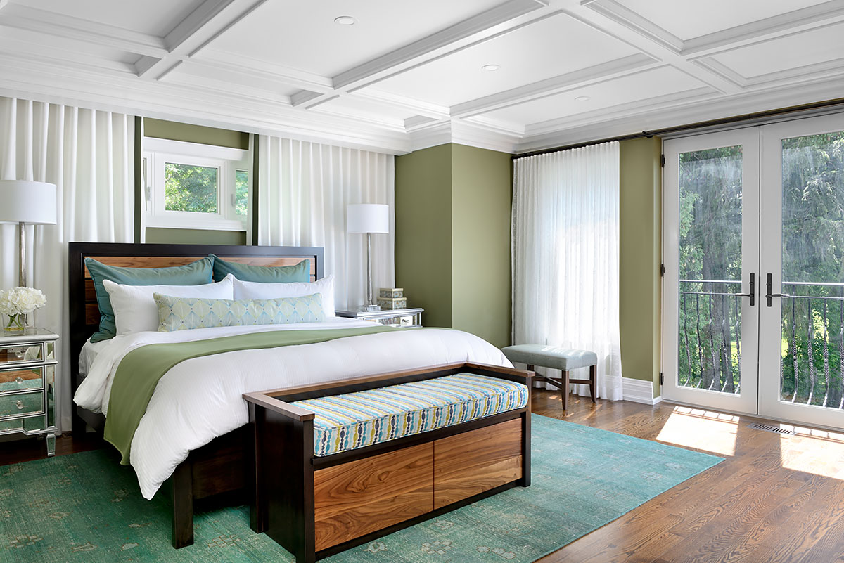
Nature’s neutral is green. It’s the simplest color to incorporate into any decor, and the options are practically endless. So, if you’re interested, here are my picks for the top five green paint colors.
How is green made?
Blue and yellow, two primary colors combined, make up the color green. With comparable or complementary color combinations, green never clashes. This implies that green always holds true when compared to other colors.
Green has a way of fitting in and complimenting its surroundings, regardless of tone or shade.
Impacts of Green
The most relaxing colors are sometimes said to be green ones. This is because green is regarded as the most “balancing” color due to the concentration of green receptors in the center of the eye and its relationship with nature.
Of course, a color is unlikely to inspire calm if you loathe it for other reasons connected to experiences or events in the past.
The color “the middle” is green. Green is always willing to comply if you want to heat it up or chill it down because it’s neither too hot nor too cold.
Green is the only color you need to consider if you’re seeking for a pure neutral or a stylish uplift. In any room, it sounds great!
The top 5 green paint colors are listed below.
Dulux A1914, Dusty Miller
The ideal light grey-green is this. If you want a backdrop that is cooler than standard grey, this is it. For emphasis, combine this with hardware in either black or gold, or go conventional with pristine white trim.
Dulux A1902 Main Street, USA
This green’s adaptability is not reflected in its name. It is neither light nor dark.
Because it has a hint of gray, it won’t be overpowering on walls.
It’s a great option for a kitchen or office. This is a fantastic option when you want the color to seem “present” in the room without dominating it.
The Dulux A1001 color Holiday Bough
Looking for a rich, livable shade of olive green? The color is as shown. When you use it in your dining room or powder room, you won’t feel “stuffed” because it is sufficiently rich.
It makes a statement without seeming like it was overreaching because it has just the right amount of body and character!
Fourth, Fresh Cut, Dulux A1044
The choice of mint might be challenging because it can smell or read as cheap or claustrophobic, similar to overused perfume. Fresh Cut has its place even though it isn’t nearly off-white.
It would look fantastic in retro settings like black-and-white bathrooms or kitchens with strong contrast colors since the green will bring the environment into equilibrium.
Dulux Tavern Green, A1939
This shade of “charred” or “blackened” green is ideal. When paired with ivory or white, it would look great in areas with a lot of contrast. Because it preserves history, depth, and charm in a single color, it’s also a great front door color.
Bonus shades of green paint!
Dulux A1055 Pale Clover
This is a brighter, mid-level green that is stronger. It goes well with stained oak cabinets that need to look more modern. To breathe new life into a den or office, add this.
A 0936 Shakespeare, Dulux
It is indeed chartreuse. A vibrant, intense color that I like! To calm it down, it blends the vigor of yellow with a few droplets of blue. This color looks great when combined with rich pink and red for a period-appropriate look. Additionally, it blends well with turquoise and navy to represent the colors of the ocean. Put this in a dark room if you want a reflecting color and brightness on an accent wall.
More on INJ Architects: