
INJ Mood Board: How Materials Shape a Project’s Identity
Fifty-one images fromthe INJ Architects visual archive explore how relationships between materials, colour and light give a project its character.
A pale surface can look warm beside grey and almost cold beside terracotta. A woven sample may soften the appearance of a polished finish. A small piece of dark stone can give an otherwise quiet arrangement a point of emphasis. Before any of these materials occupies a room, placing them together begins to reveal the kind of room they might create.
This is where a mood board becomes useful within our Interior Design process, connecting architectural intention with material selection, lighting and the experience of the room. It gives an emerging intention a physical or visual form that can be discussed, questioned and revised. A project’s identity begins to take shape through the relationships between its parts: what occupies the largest area, what attracts attention, what recedes and what connects one surface to the next.
The images gathered here come from the INJ Architects photographic and visual reference archive. They include material compositions, display boards, sample books, photographic collages and comparisons made within unfinished interiors. Read together, they show several stages of thinking through a palette, from an initial visual attraction to a choice tested against the conditions of a space.
Begin with an atmosphere
An early reference may be a landscape, a colour interval or a surface that holds a particular memory. Translating that attraction into a room requires a sequence of decisions. The reference establishes a direction; a palette identifies its main colours; a material study gives those colours texture, depth and a possible architectural use.
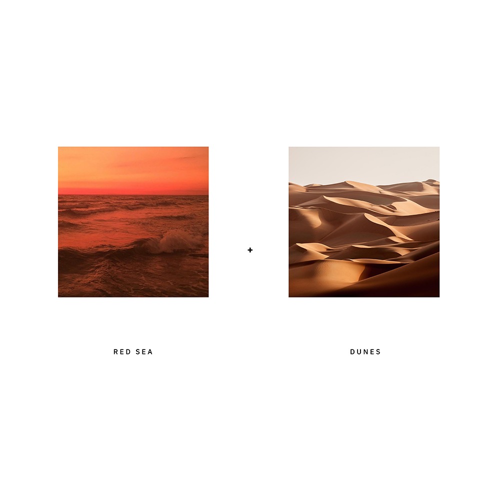
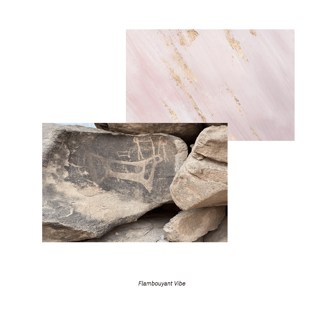
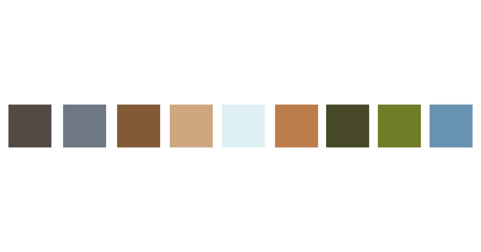
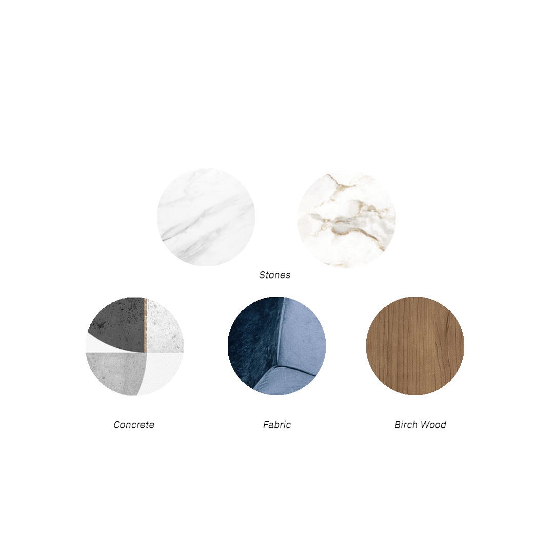
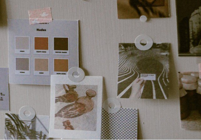
These records also show why a palette should retain the idea that generated it. A sandy colour alone says little about the experience of a landscape. Grain, brightness, shadow and the transitions between surfaces may carry that experience more convincingly.
Give each material a role
A board becomes easier to read when its elements have different jobs. One surface might establish the background. Another may provide warmth at the places people touch. A third could mark an entrance, a piece of furniture or a transition between rooms. These roles help turn an attractive assortment into a proposal with a clear internal order.
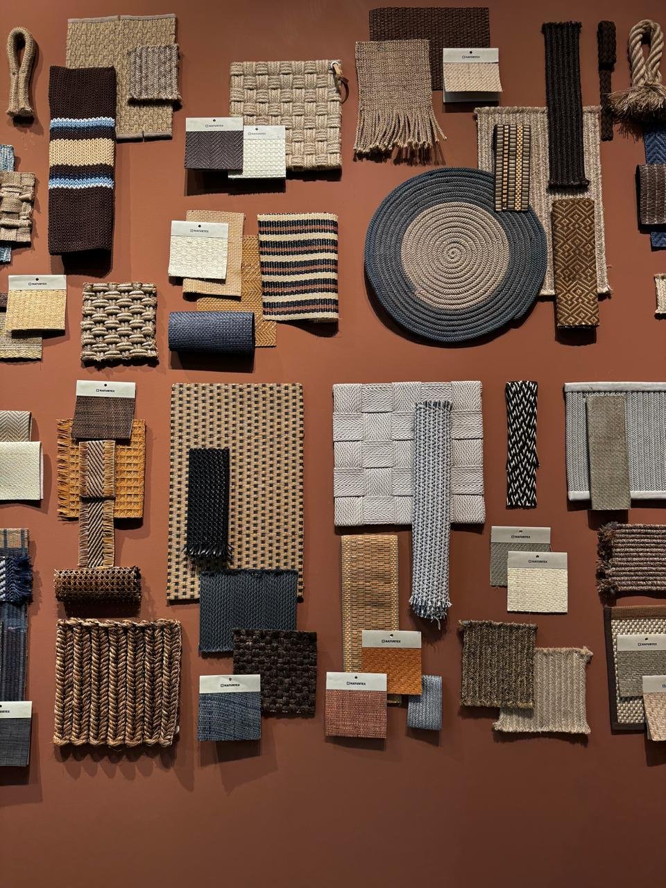
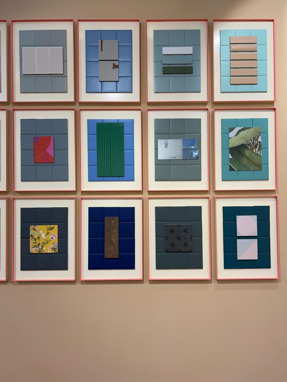
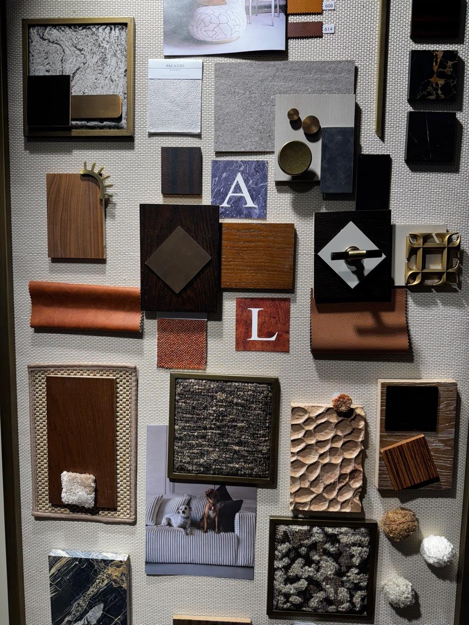
The broad mixed material board invites a close reading because so many kinds of surface share the frame. The smaller framed compositions work through a more restricted set of elements. Both can be useful. The question is whether the arrangement makes its priorities legible, and whether those priorities could survive beyond the dimensions of the board.
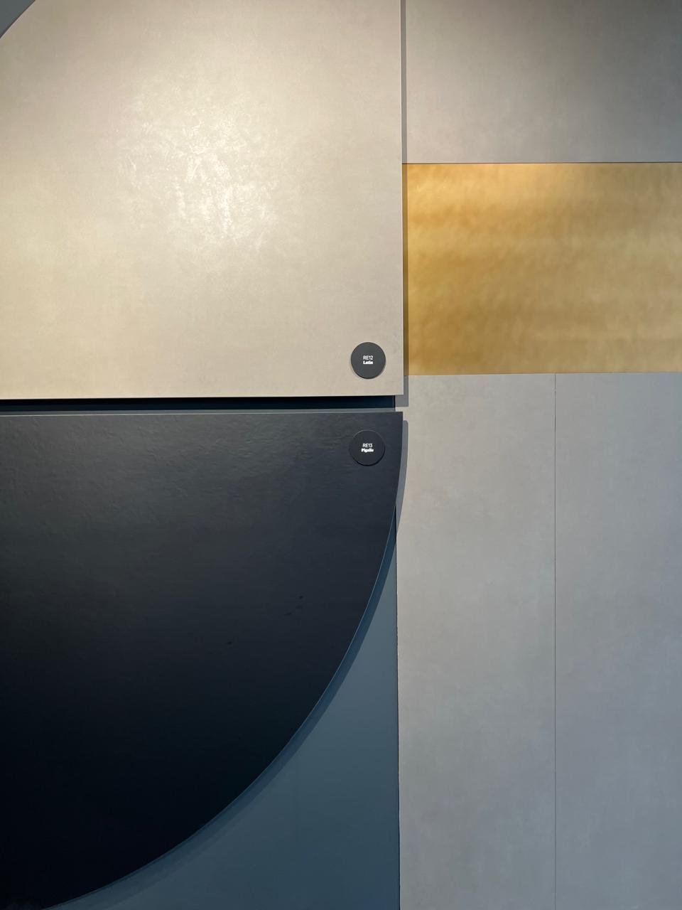
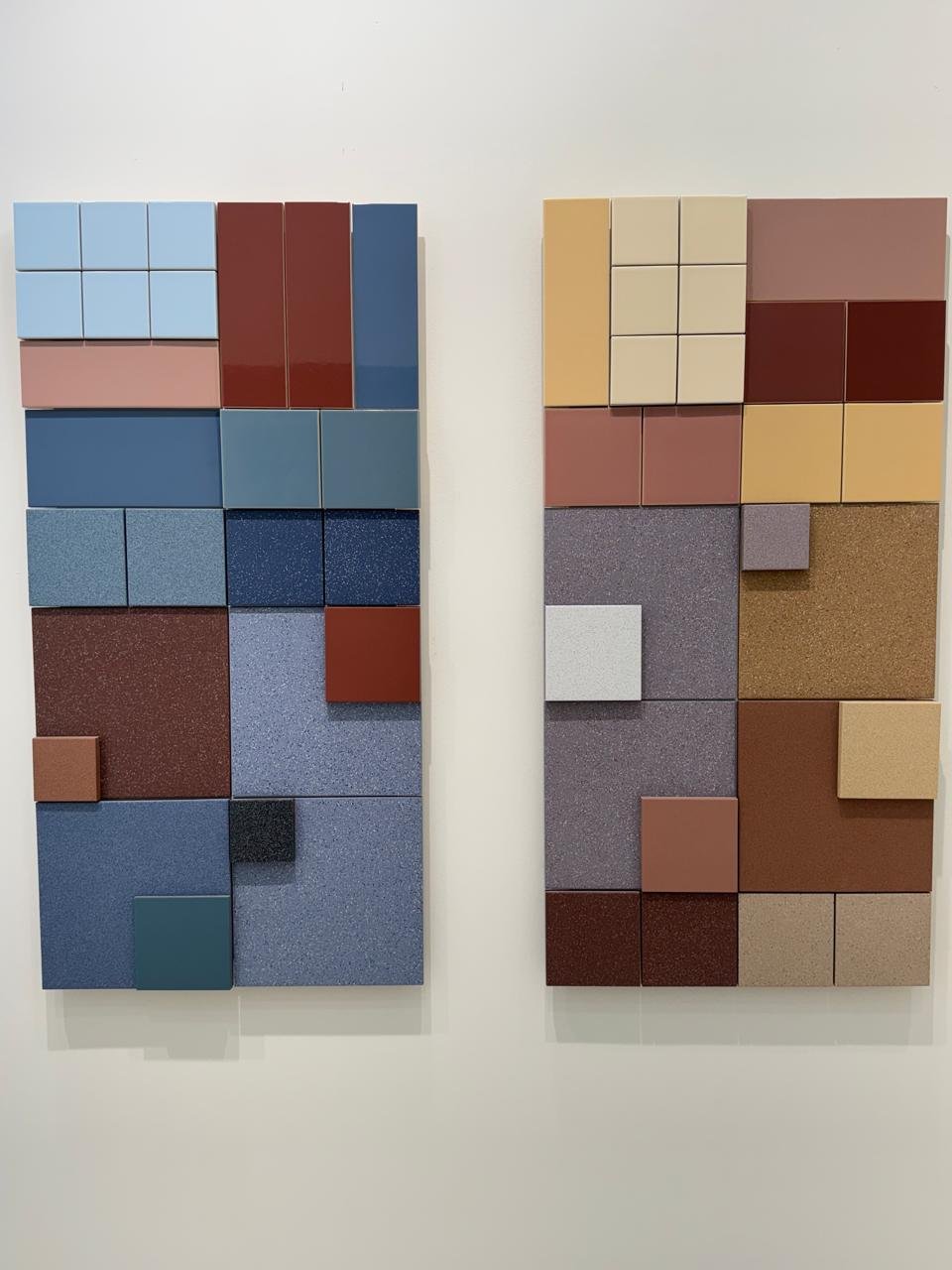
Proportion matters at this early stage. Two equal samples may suggest an equal presence, even when one is intended to cover a floor and the other to appear only as a narrow edge. Giving the dominant finish more space on the board, or showing the proposed areas in a simple sketch alongside it, helps make the intention explicit. A project can feel entirely different when the same colours are used in different quantities.
Read colour across a family of finishes
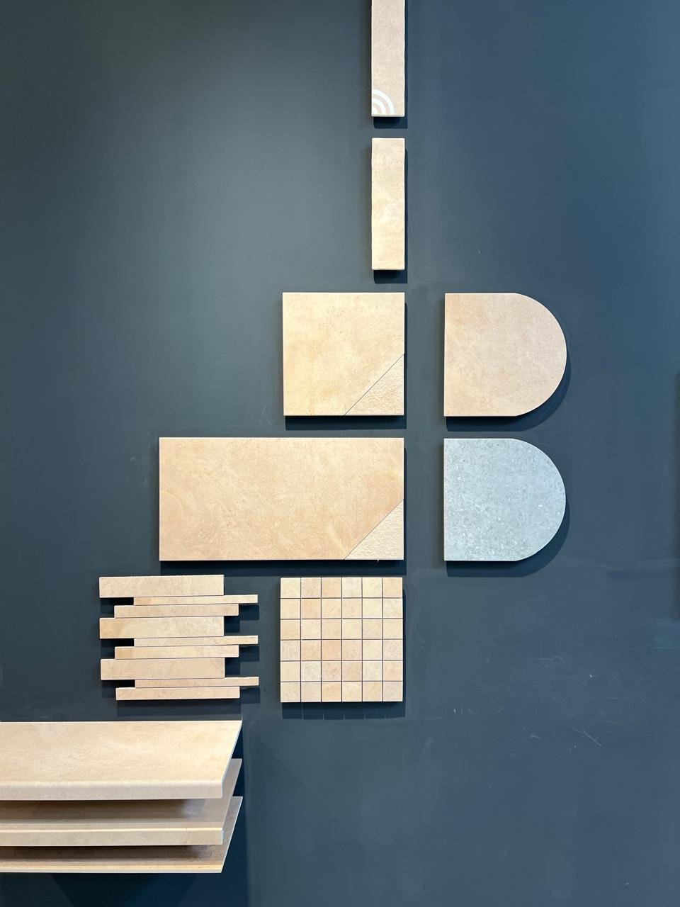
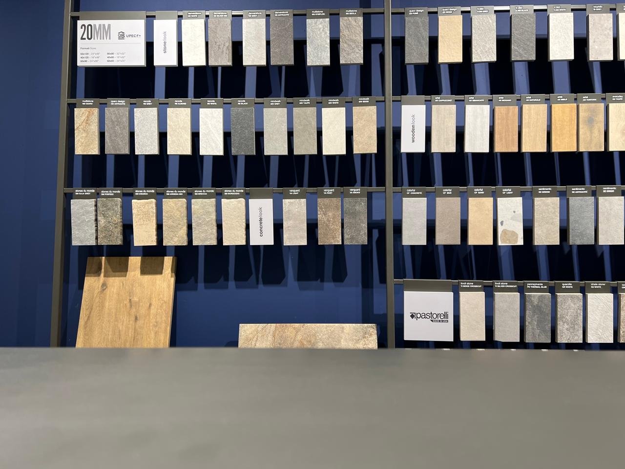
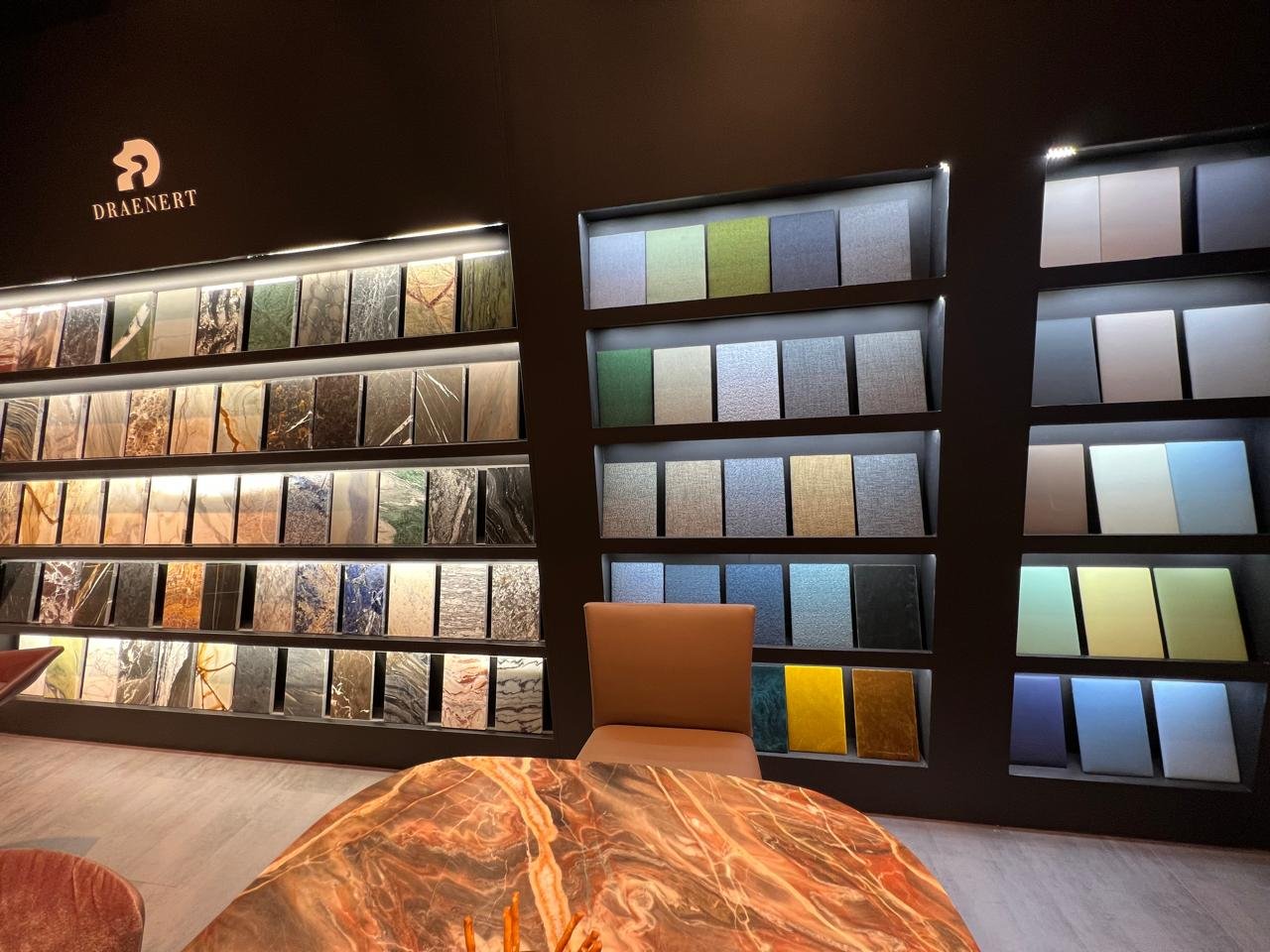
Supplier displays offer a wider field of comparison than a finished project board. They help expose the small differences hidden by labels such as beige, grey or warm white. The useful step is to select a limited family from that field, then establish how much of each colour the room can carry.
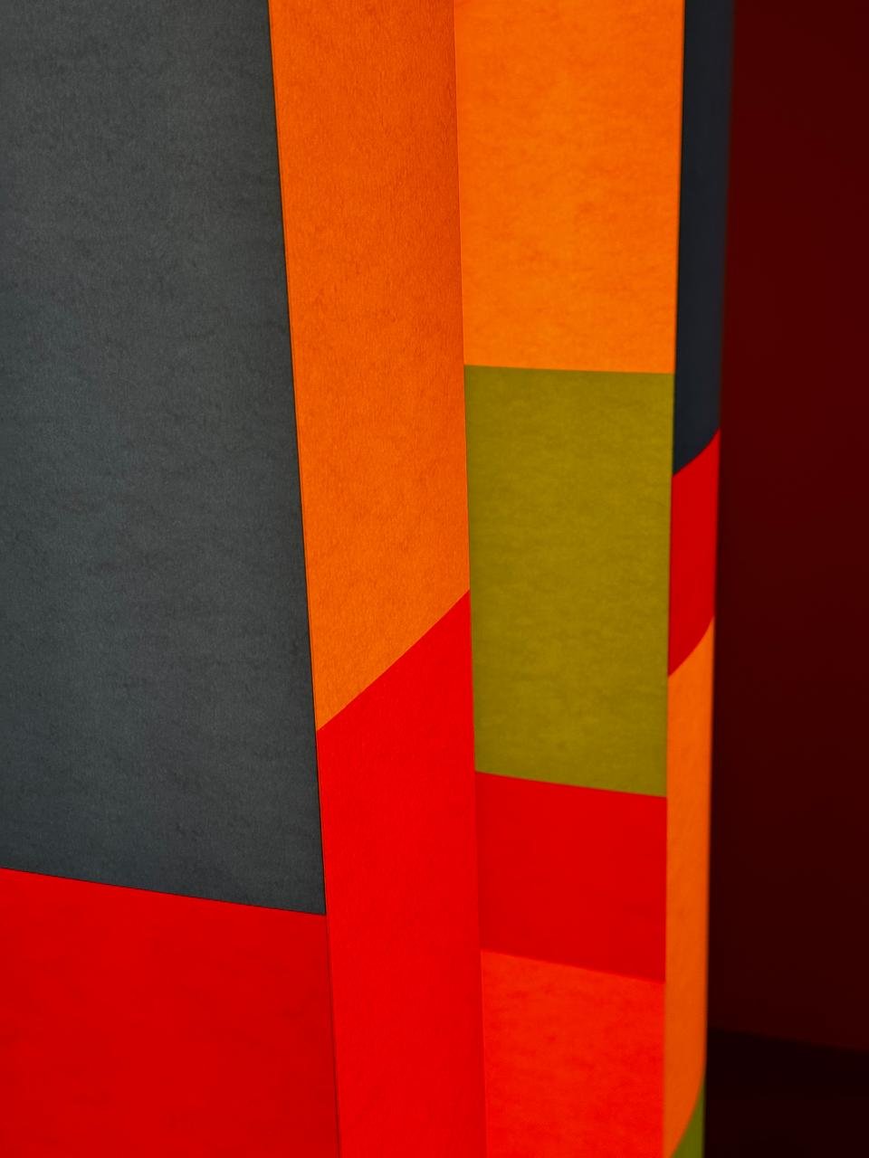
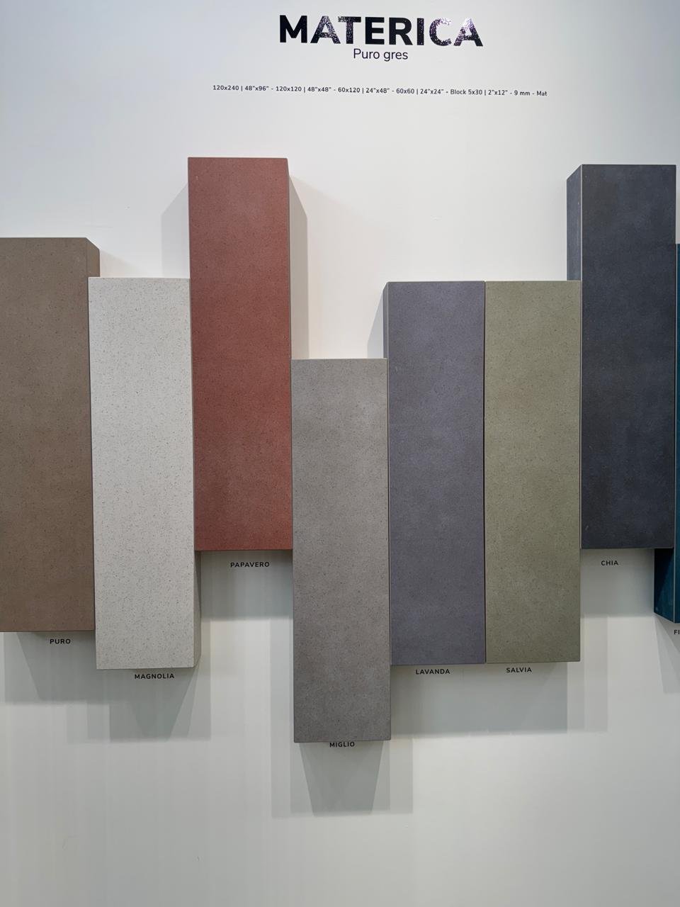
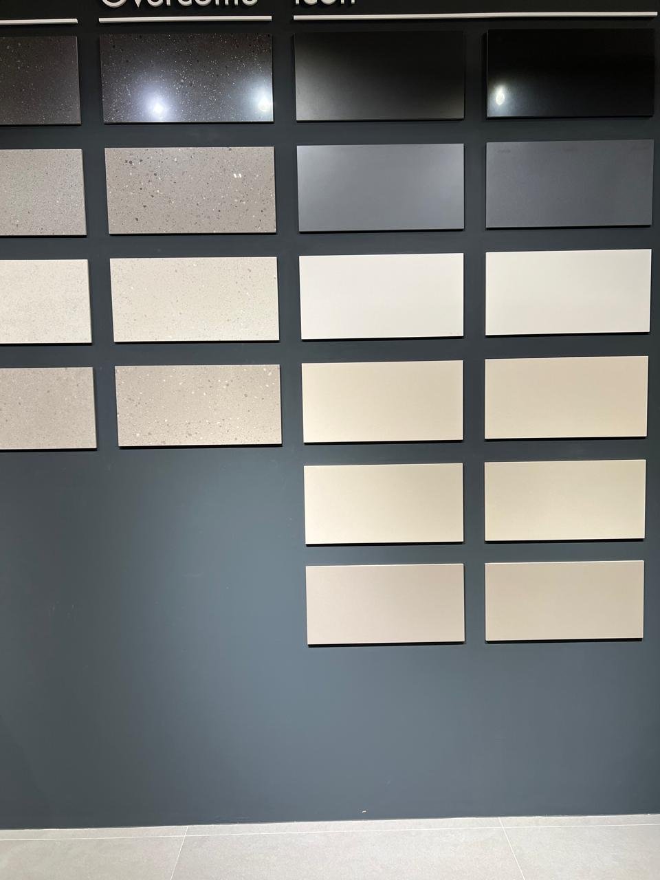
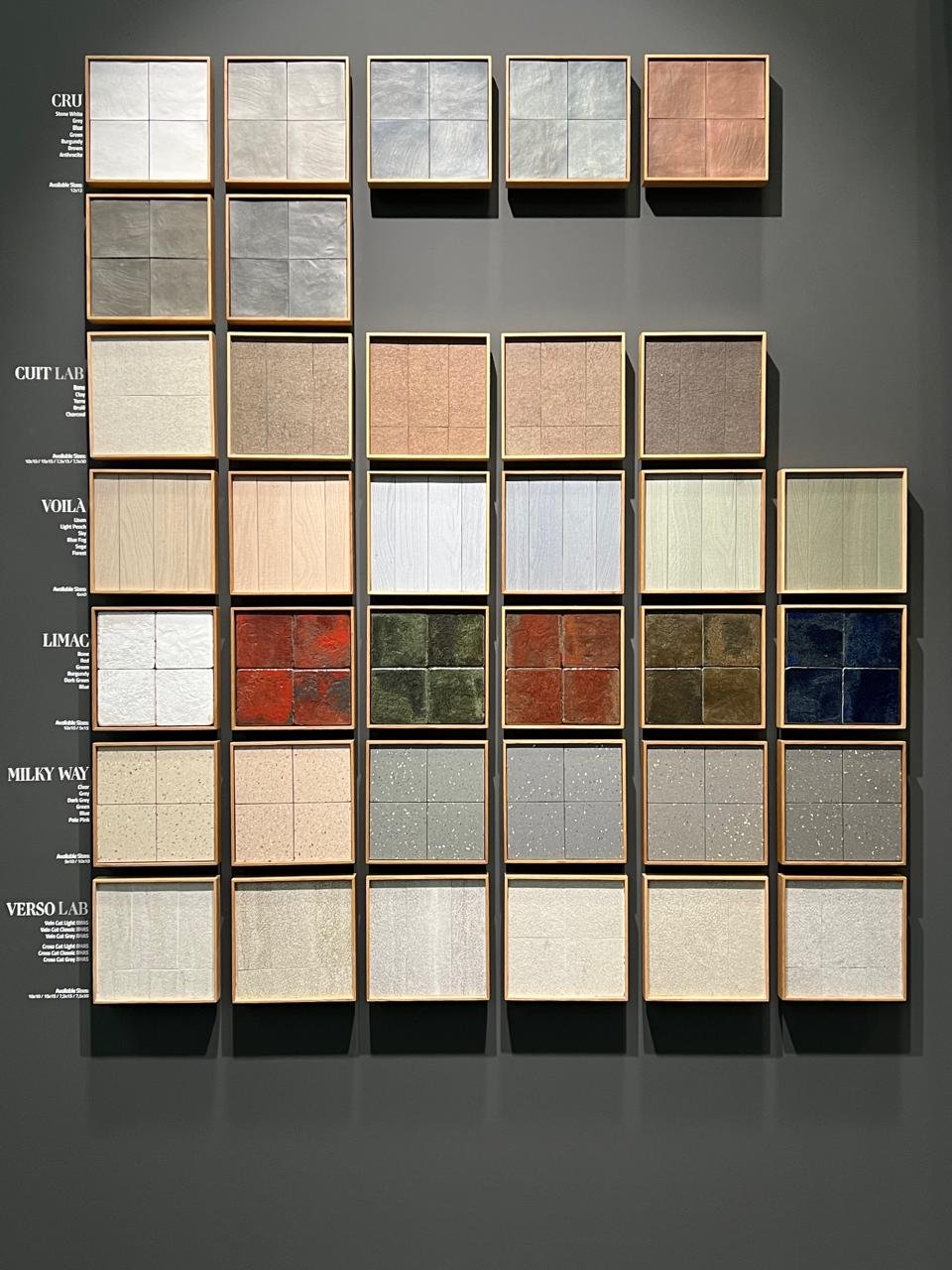
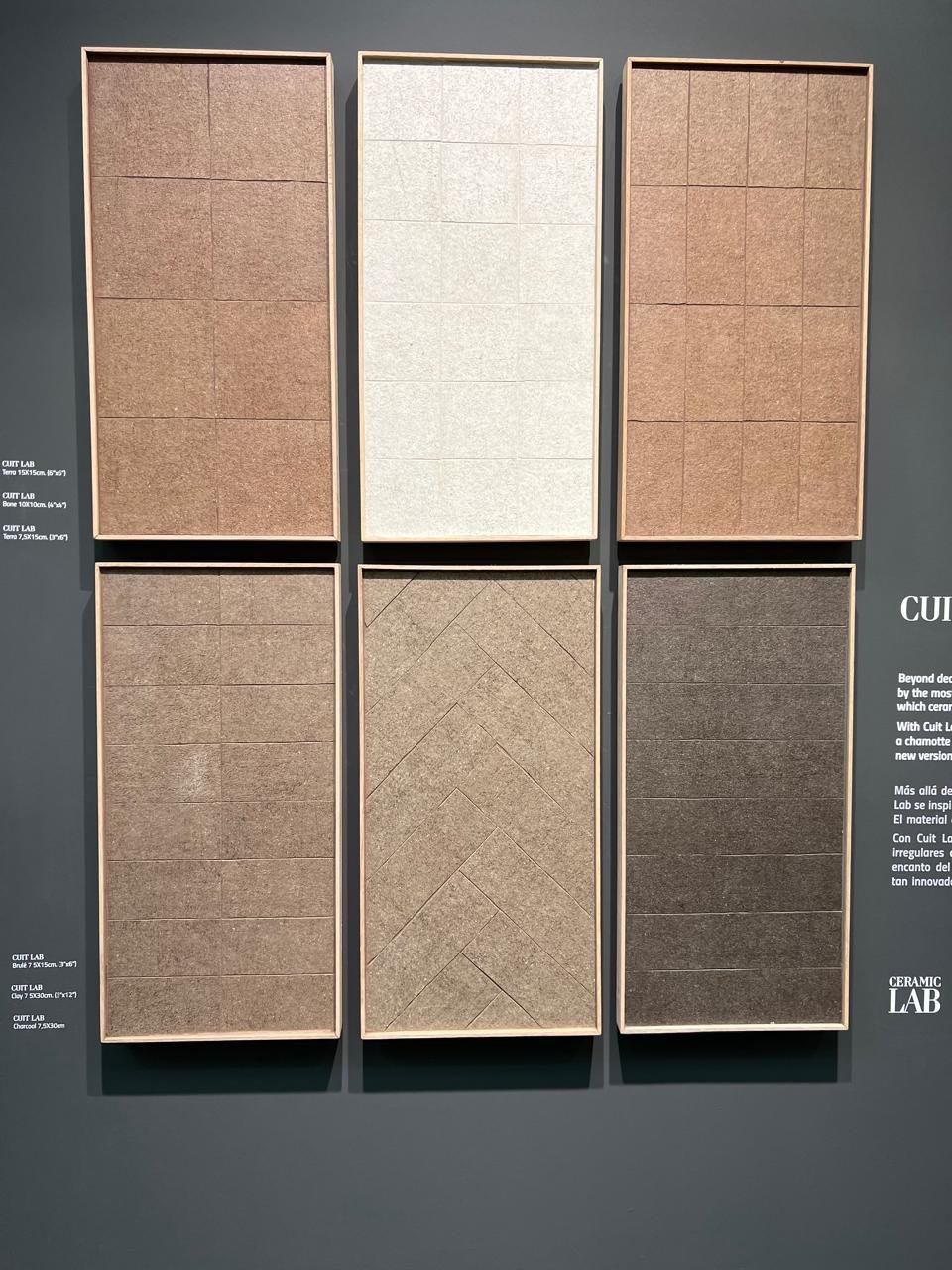
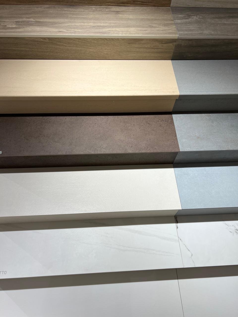
The arrangement should be tested at the scale of its intended use. A strong colour that works as a small accent can dominate a whole wall. Conversely, a slight difference between adjacent pale samples may become important across a large continuous surface.
Let texture carry some of the identity
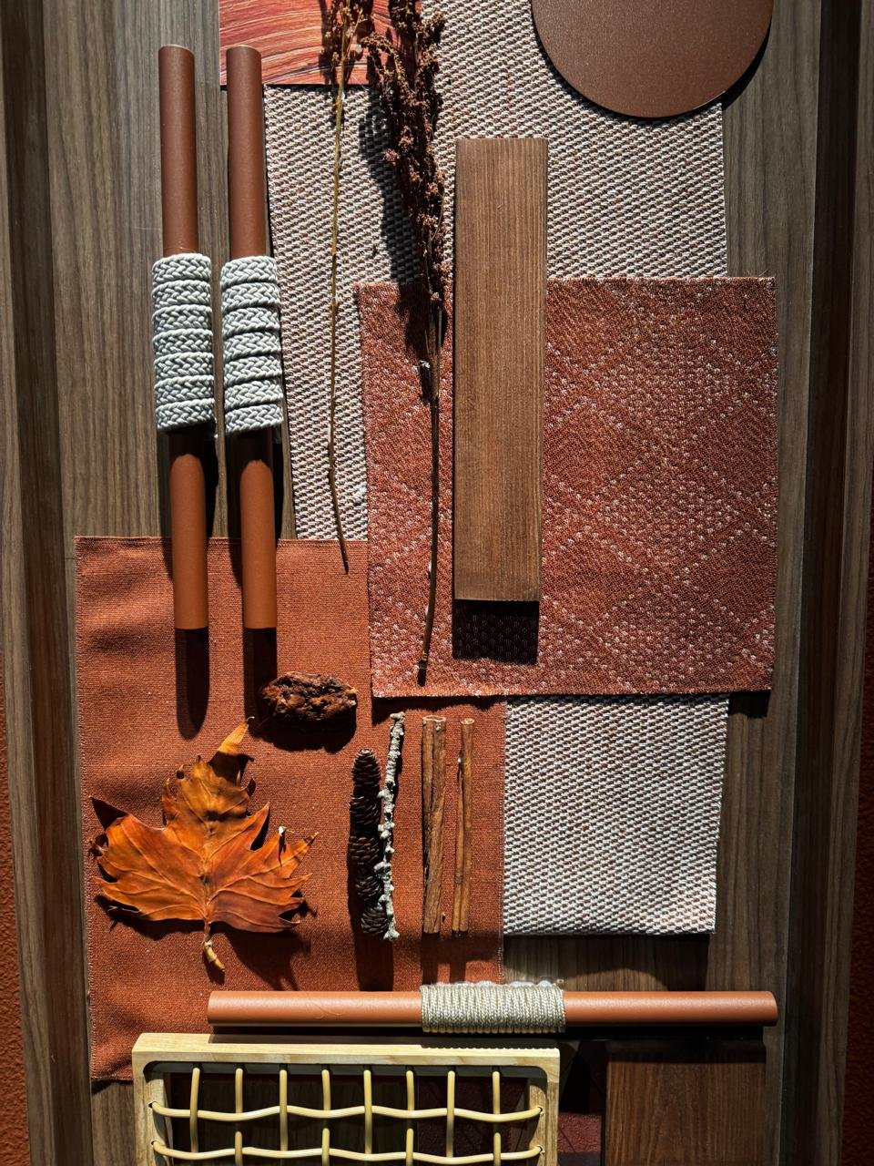
Colour draws attention quickly, but texture often sustains it. The neutral fabric display brings closely related tones together while allowing folds, weave and surface to do the work of differentiation. The warmer swatches show a similar principle: rust, brown, cream and grey acquire much of their character from the way they are woven.

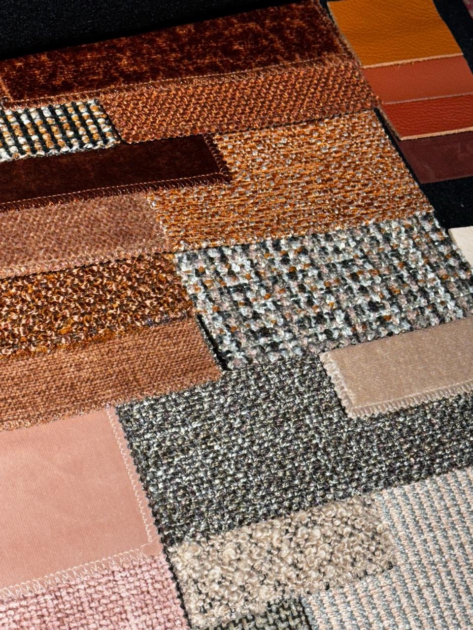
A restrained palette can therefore hold considerable variety. Rough and smooth, dense and open, reflective and absorbent surfaces establish relationships that remain interesting at close range. A material board is particularly valuable when it lets a client or designer encounter those differences directly, with the samples in hand.
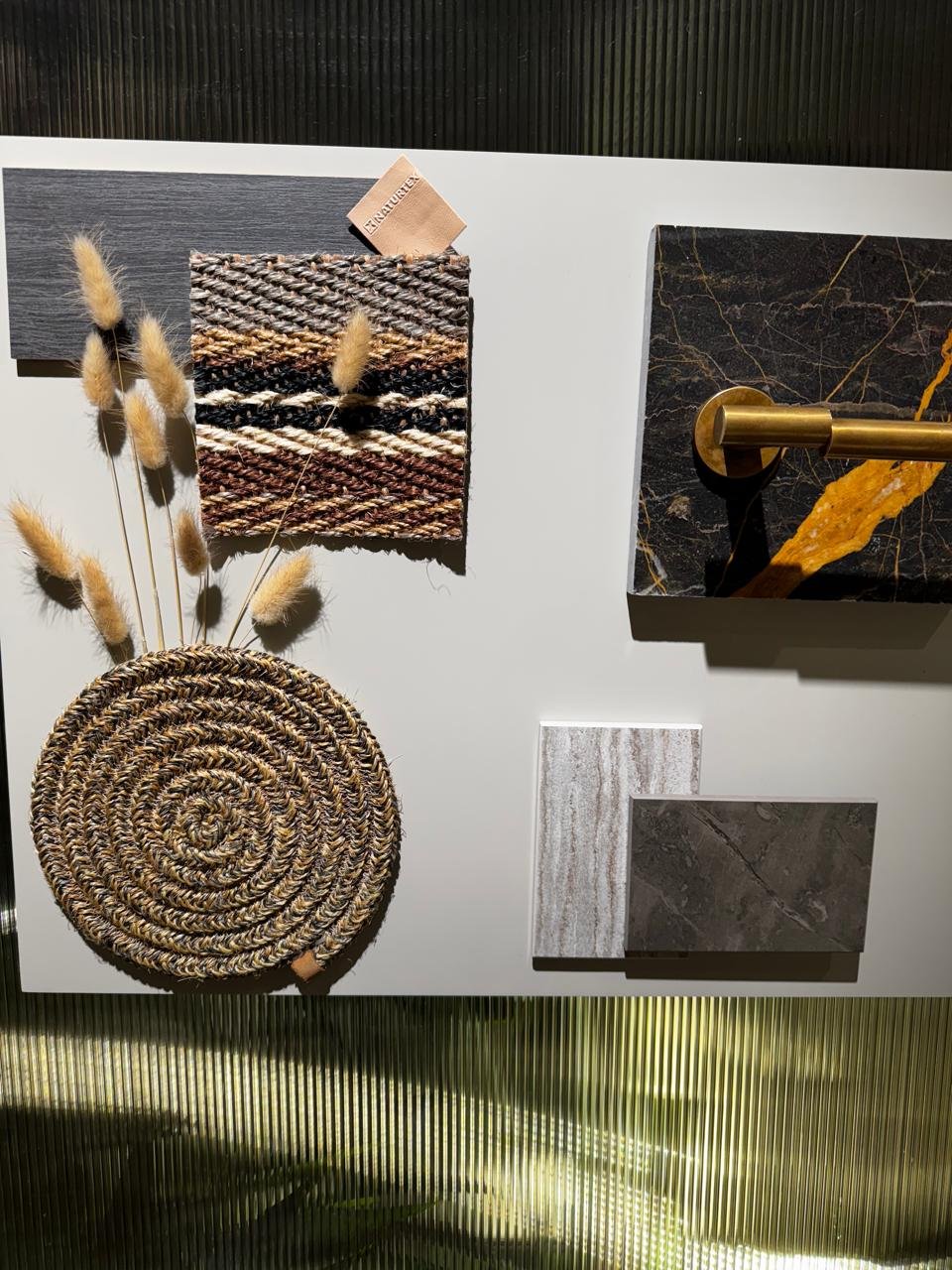
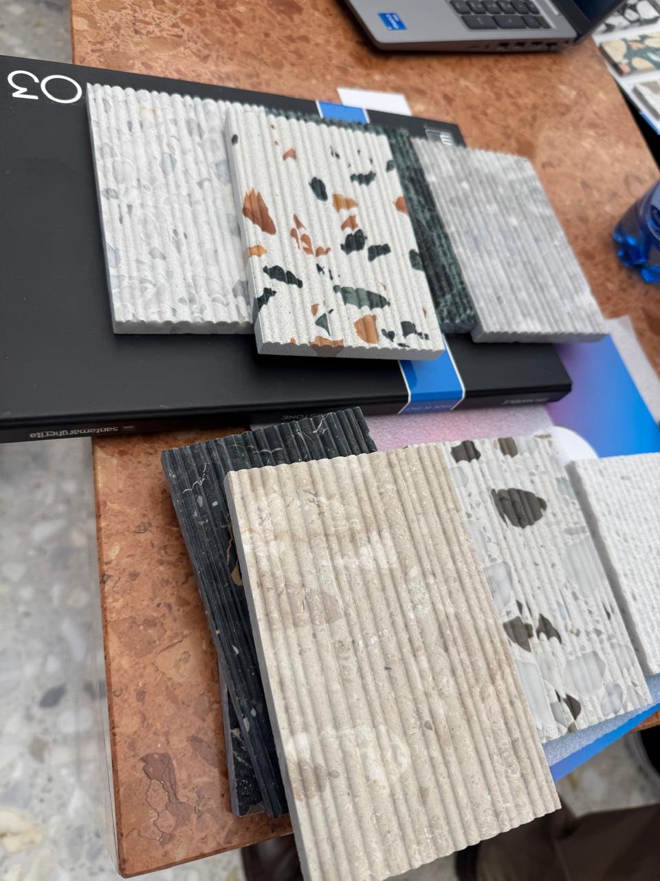
Photographs preserve the arrangement and make it easier to compare alternatives later. Physical samples contribute weight, touch and a changing response to light. Used together, they give a fuller basis for discussion. An open sample book can reveal small differences that disappear when every surface is reduced to the same sized image on a screen.
Compare the behaviour of surfaces
A photograph records the appearance of a finish under one set of conditions. A physical sample allows the comparison to continue as the viewer moves. Relief catches shadow; reflective finishes carry parts of their surroundings; aggregate creates a texture that reads differently from near and far.


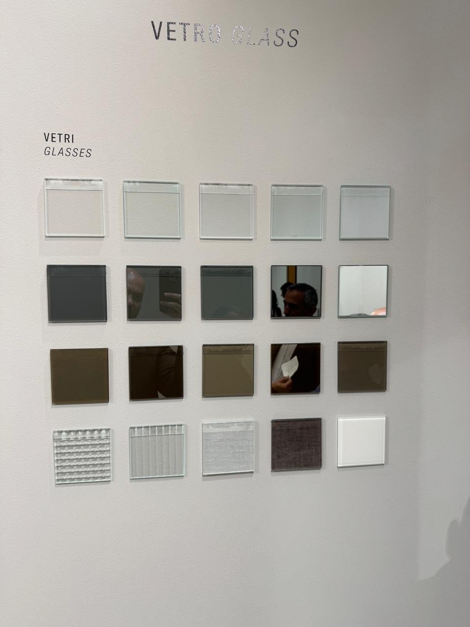
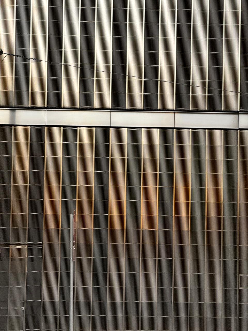
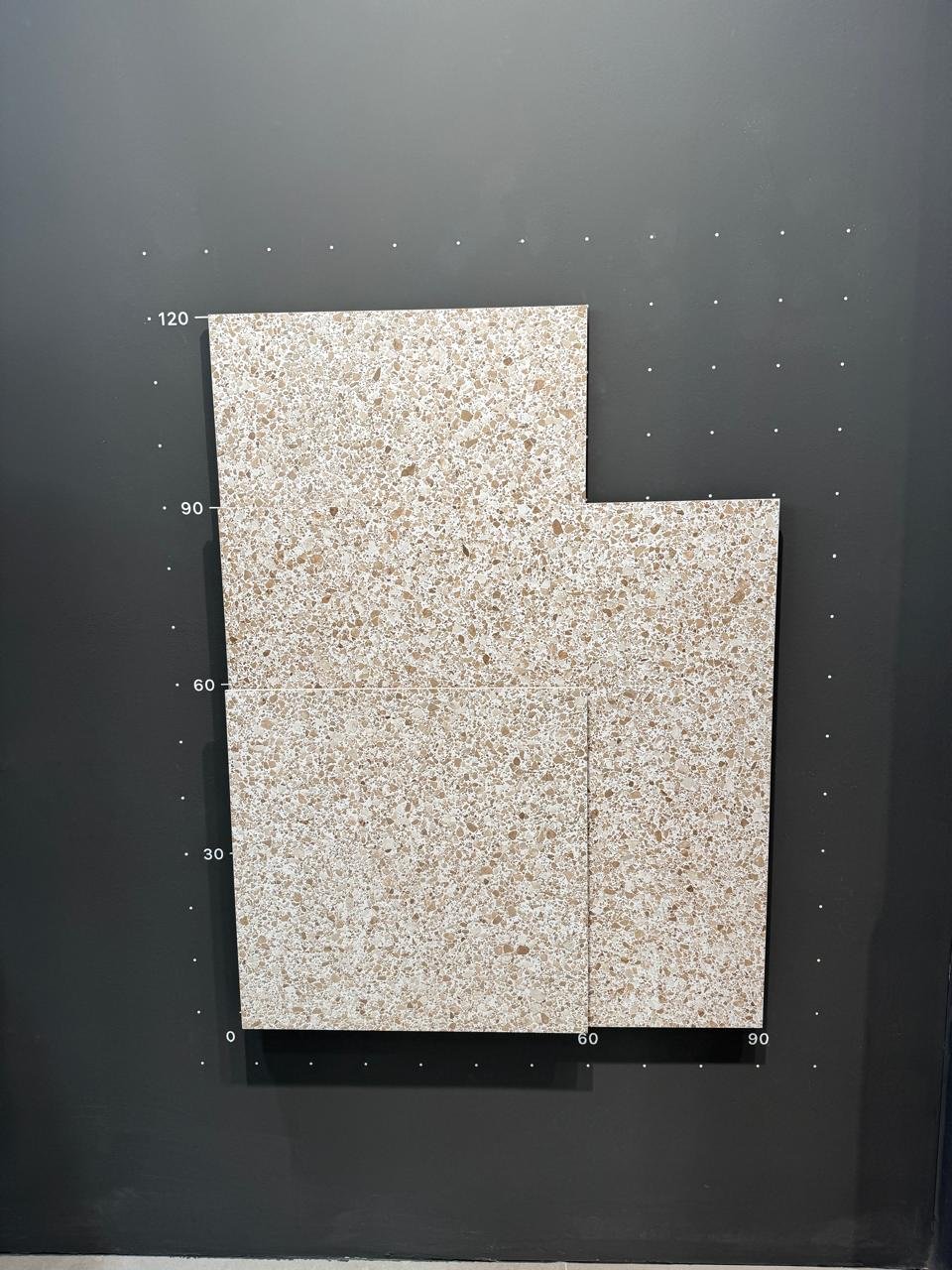
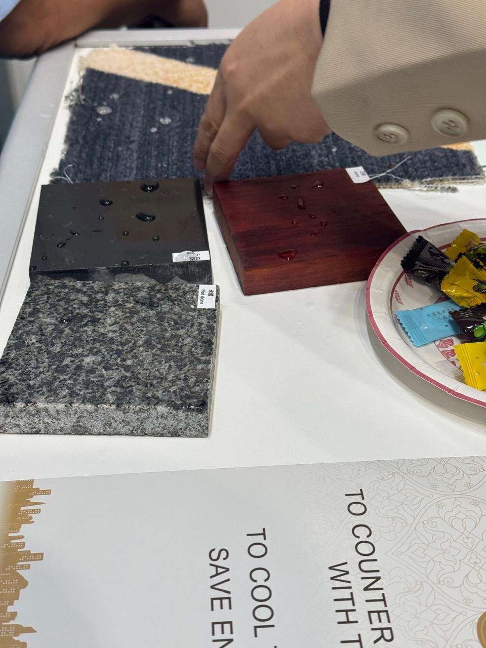
A useful review records what was observed as well as what was chosen. The same colour can read differently on a flat panel, a curved object or a textured weave. Keeping those observations with the sample helps the next decision remain consistent.
Choose a language for pattern
Pattern introduces another scale of decision. In one arrangement, botanical marks sit beside a dark green grid and a pale veined surface. Elsewhere, fine lines, large aggregate and stronger veins occupy adjoining samples. Each has its own density and direction. Their relationship will change again when a small fragment becomes a wall, a floor or a long piece of joinery.
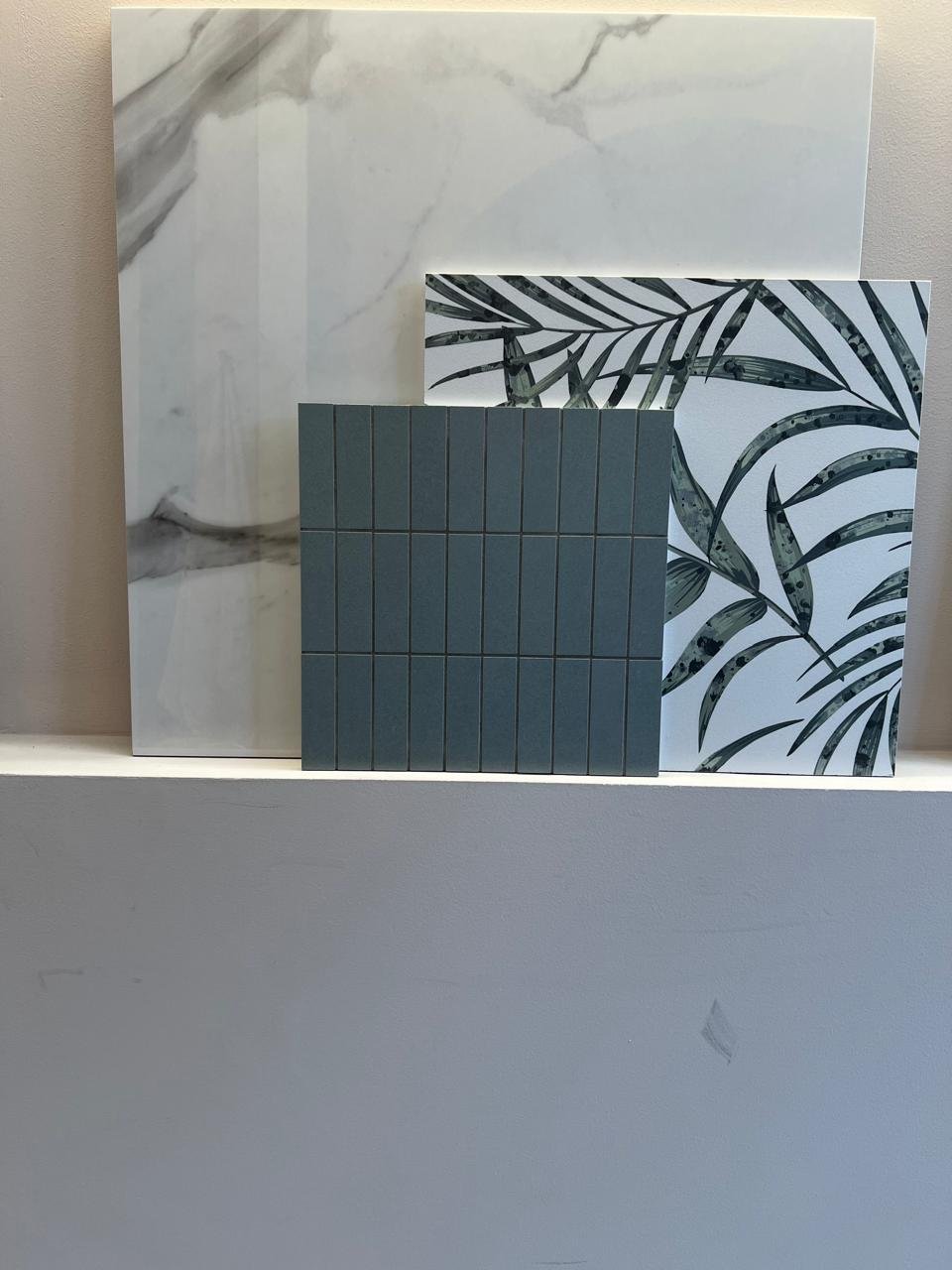
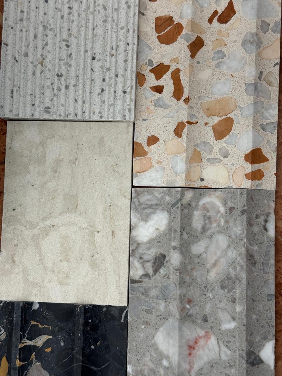
This makes the size of the sample important. A fragment may communicate a colour successfully while revealing very little about the complete repeat or the movement of a larger slab. As a scheme develops, the board can be supplemented with larger samples, full pattern views and drawings that show where a joint or edge will interrupt the surface.
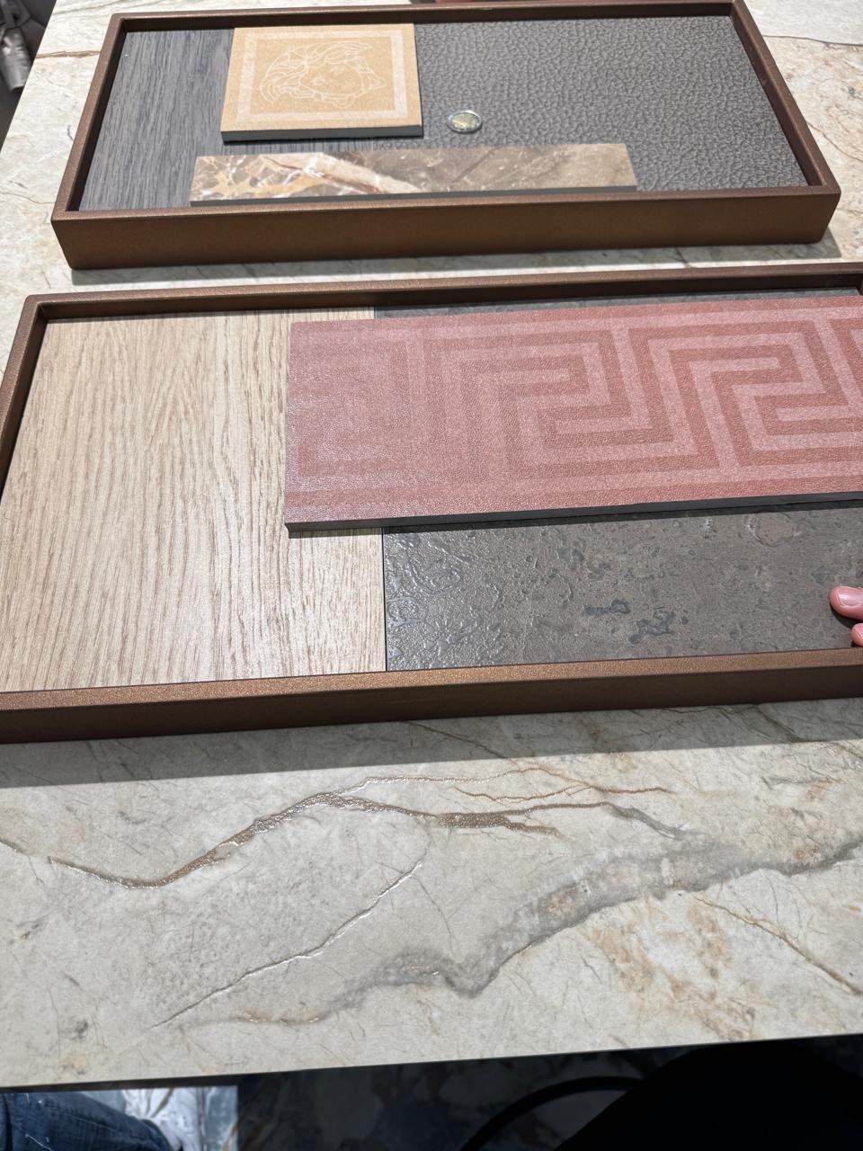

A small patterned accent can be enough to change the character of a quiet composition. The pink geometric sample and the layered green arrangement offer two different readings of this idea. Identity emerges through the strength and placement of the accent as much as through the accent itself.
Follow pattern from sample to surface
A material arrangement can suggest the geometry of an interior as well as its colour. Curves, narrow strips, strong veins and repeated motifs introduce different rhythms. Their value becomes clearer when considered beside the dimensions of a wall, the position of a joint and the lines of nearby furniture.
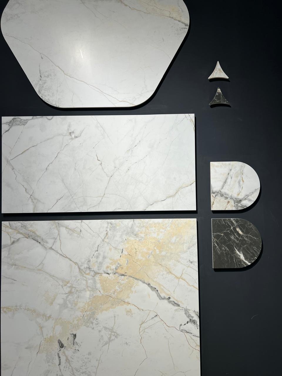
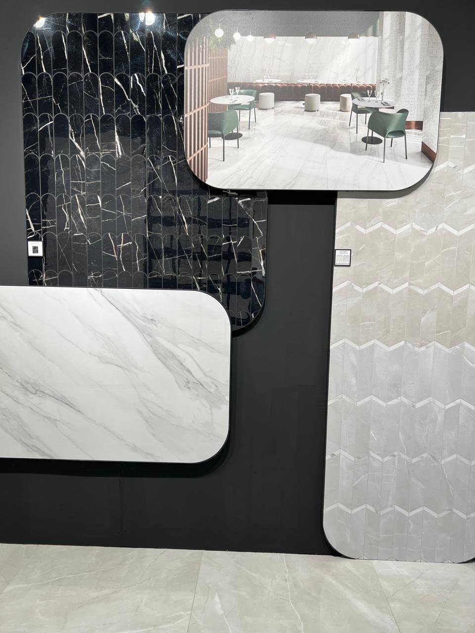
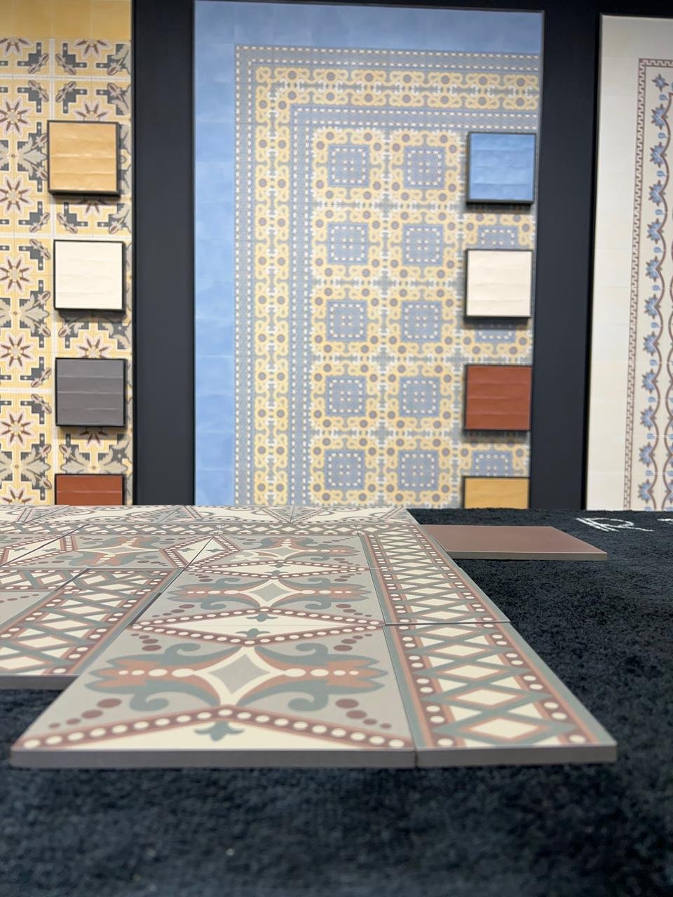
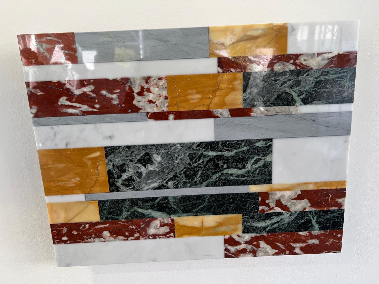

The board can hold several directions during exploration. As a project develops, those directions need a hierarchy so that patterns support the spatial idea and remain legible when viewed together.
Bring light and objects into the conversation
The lighting collage widens the discussion beyond flat surfaces. Pendants have silhouettes, intervals and visible sources of light. Their presence affects how an interior is read even before their illumination reaches the surrounding materials.
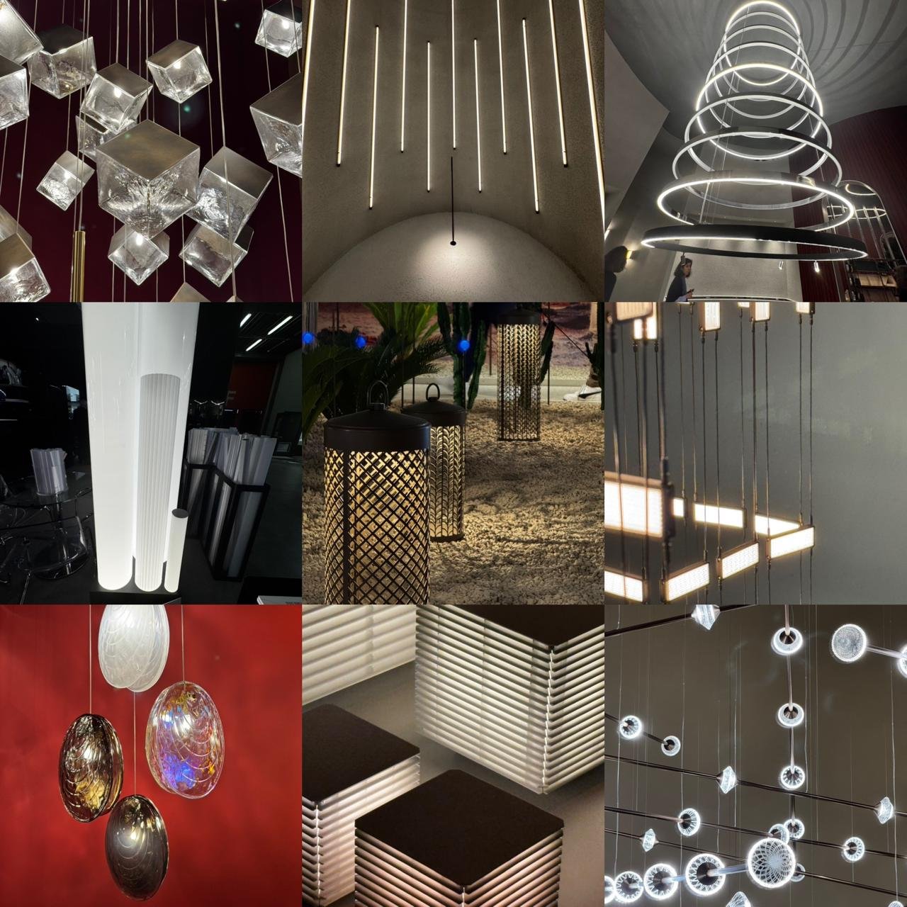
These references can help establish an atmosphere, provided they remain connected to the room being designed. The attention given to overhead elements in Ceilography offers a related way of looking: the ceiling, its fittings and the distribution of light belong within the material conversation. A board becomes more informative when it is considered beside a plan, a section or a photograph of the space.
Photographic references also encourage comparison across separate visits. A useful record keeps the source, material reference and intended use close to the image. It allows a promising visual relationship to be revisited without losing the information needed to investigate it further.
Carry the palette into the details
Handles, fittings, furniture and outdoor elements bring the palette into everyday contact. Their finishes need to be considered beside the larger surfaces around them. Photographic records help connect these small decisions to the broader atmosphere, while preserving observations from separate visits.
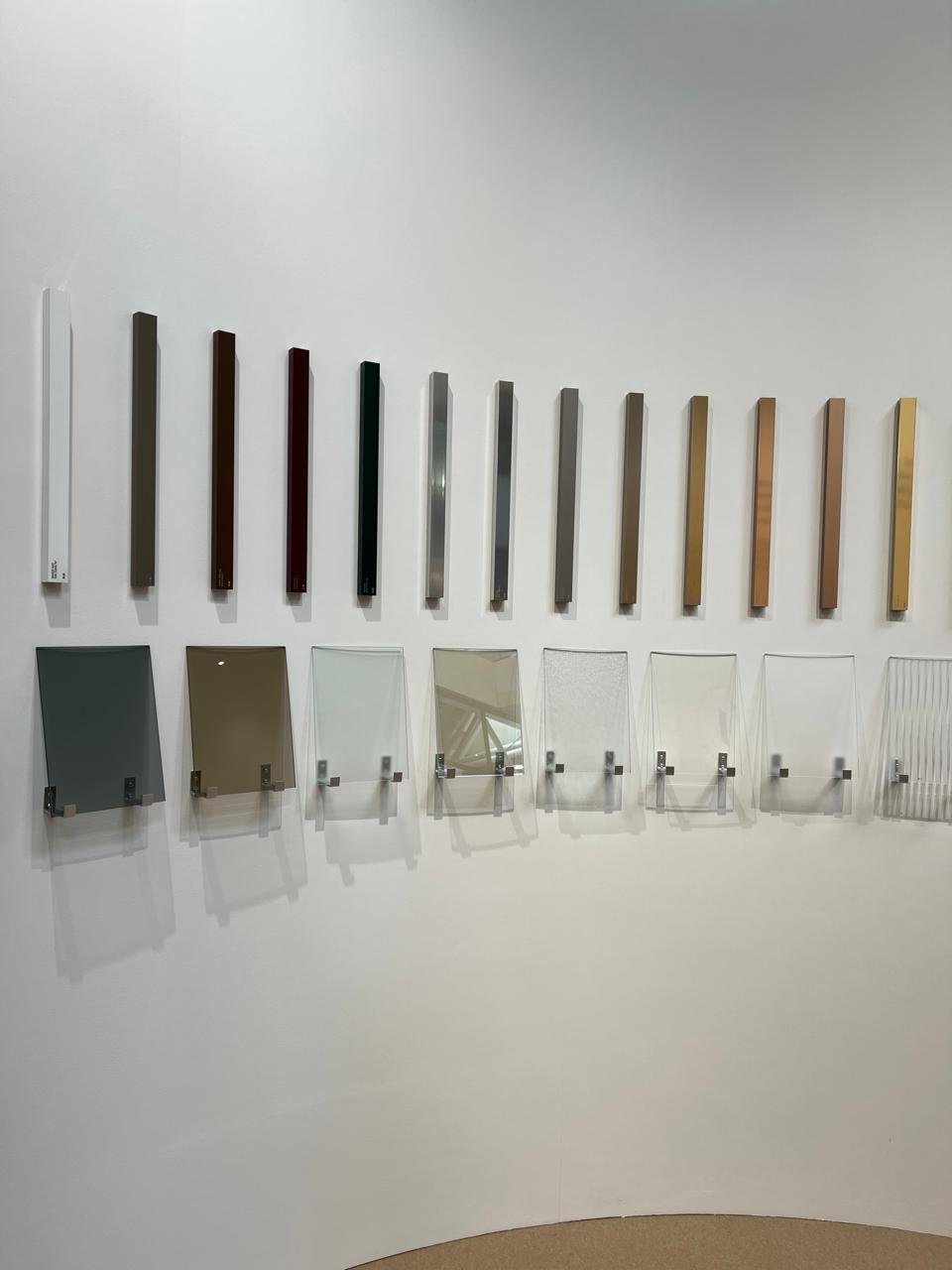


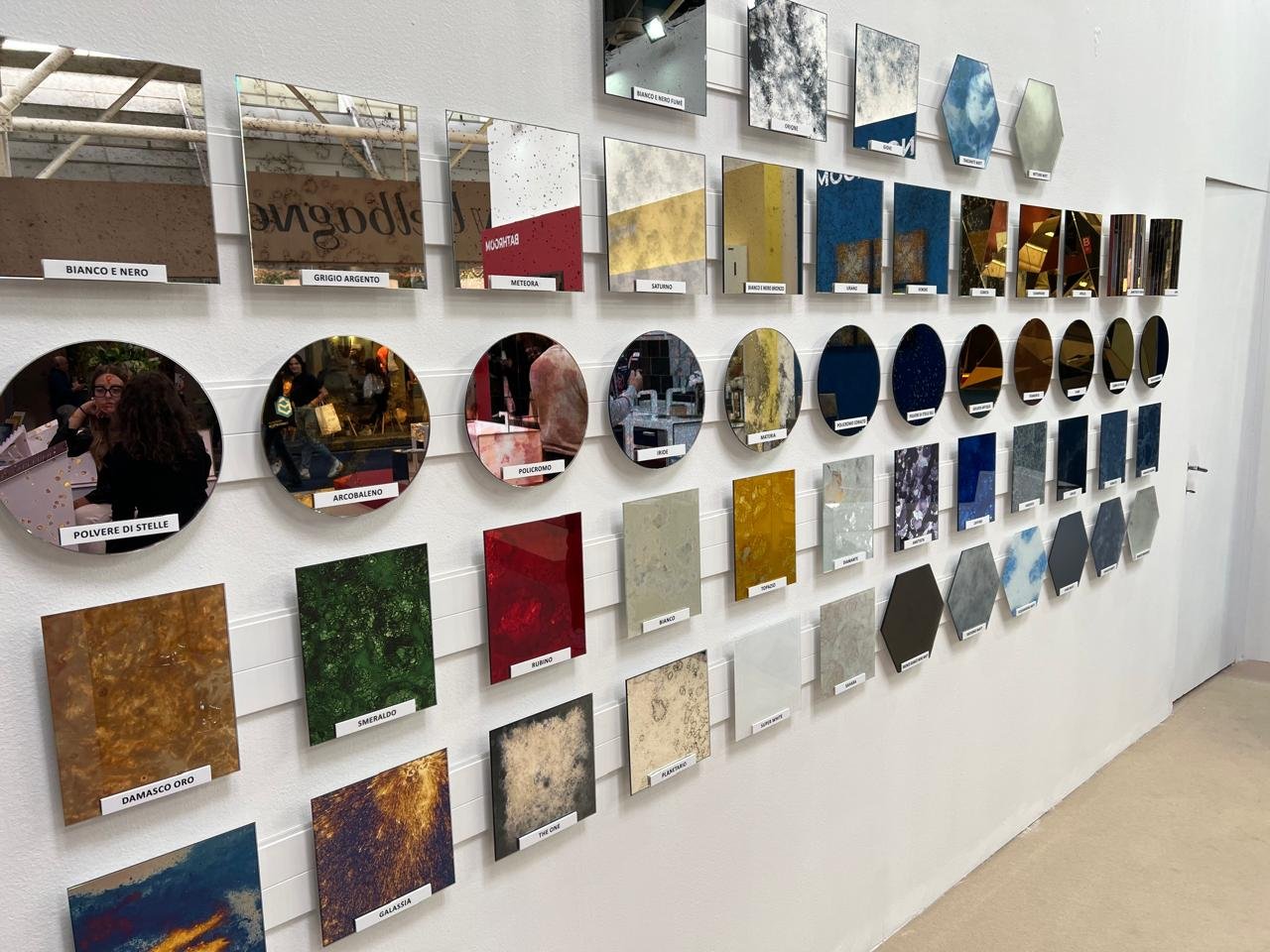
These exhibition and supplier references document the search for materials. They become project decisions only after their suitability, dimensions and relationship to the proposed space have been examined. The distinction keeps an exploratory archive useful without treating every photographed product as a specified item.
Take the board into the room
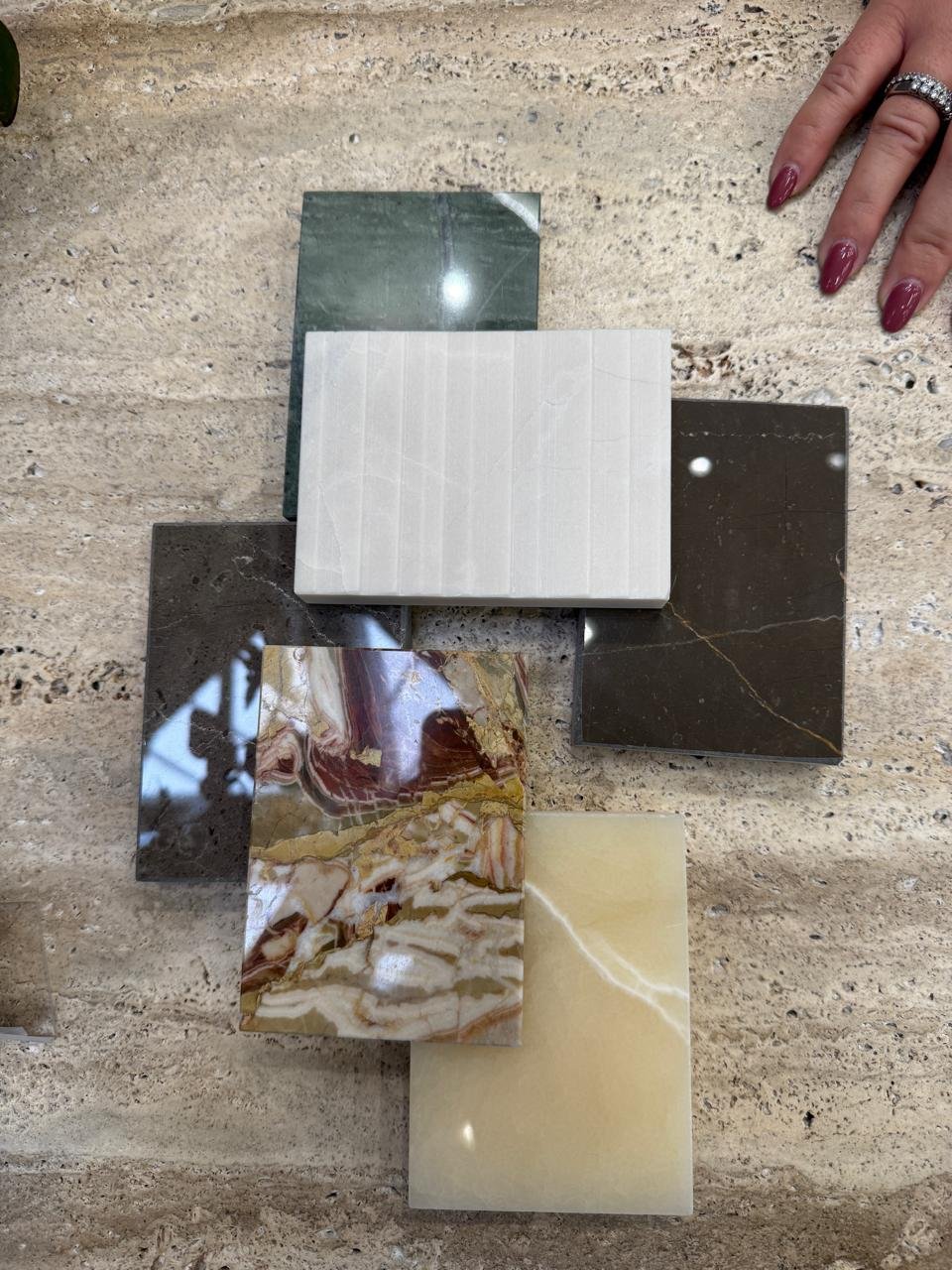
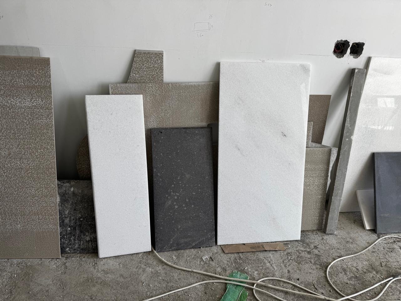
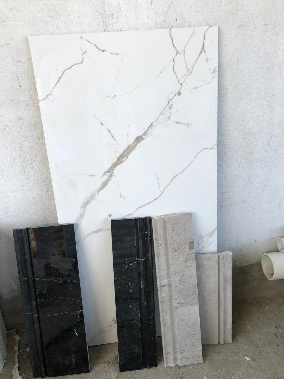
The photographs of larger samples inside unfinished interiors bring the discussion closer to construction. The pieces stand against actual walls and beside existing surfaces. The surrounding light, floor and background begin to participate in the decision. Materials that worked well together in a display may establish a different balance in this setting.
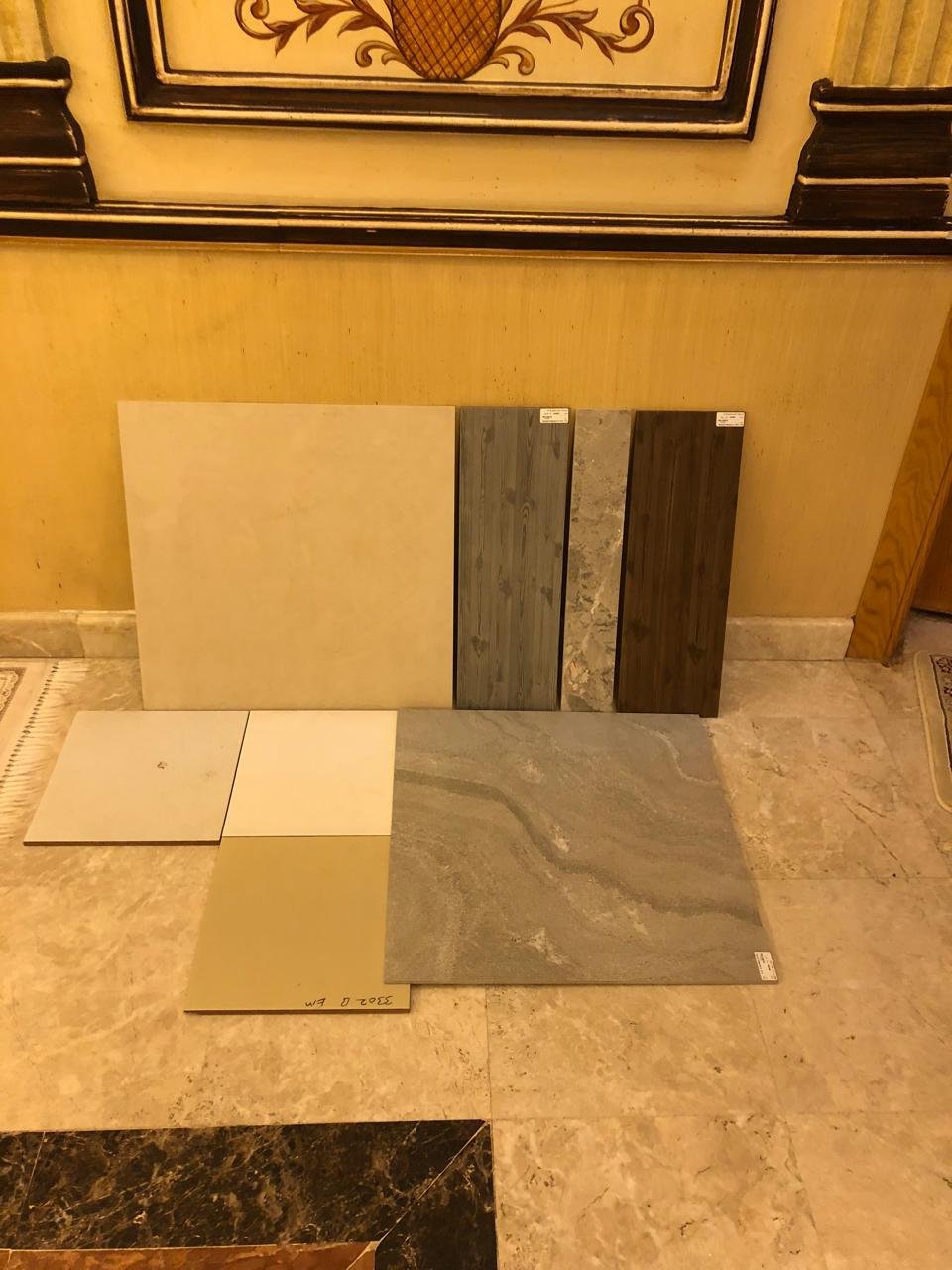

Here the board becomes a testable proposition. Samples can be compared upright and flat, viewed near the intended adjacent finishes and revisited under the lighting conditions that matter to the project. A large pale finish may appear quiet in isolation, yet become the brightest element in a room. A dark sample may provide the contrast needed to make a junction clear.
The move from composition to selection also requires a different kind of record. Product references, dimensions, finish, intended location and approval status need to be traceable. Practical requirements such as maintenance, suitability for the proposed use and availability belong in that decision. The visual coherence of the board provides direction; the project documentation carries the information needed to realise it.
Build a record that can be used on site
An extensive reference archive becomes easier to use when every promising image leads back to a sample or source. Broad display photographs preserve the range encountered; closer views help isolate a possible choice. On site, larger pieces test that choice against the actual room.

At selection stage, a short register can connect each chosen sample to its product reference, proposed location, finish, dimensions and review date. Approved samples should remain identifiable when alternatives arrive. This gives the mood board a practical continuation in the material schedule and the site review.
An identity that can survive change
A good mood board remains useful when a sample has to be replaced. If the original reasoning is clear, the team can identify what the material contributed: a warm background, a quiet texture, a reflective edge or a particular scale of pattern. An alternative can then be assessed against that role.
This is also why keeping a visual archive matters. Alongside the more experimental photographic observations explored in Move Art, records of samples and arrangements preserve a practical history of looking. They make it possible to revisit a relationship, understand a choice and recognise an idea that deserves further development.
The board earns its place in the design process when it continues to guide those decisions. A project’s identity becomes convincing through the consistency of its relationships, from the first samples brought together to the surfaces encountered in the completed space.